Tag Archives: r programming

R for Beginners: Some Simple Code to Produce Informative Graphs, Part One


A Tutorial by D. M. Wiig

The R programming language has a multitude of packages that can be used to display various types of graph. For a new user looking to display data in a meaningful way graphing functions can look very intimidating. When using a statistics package such as SPSS, Stata, Minitab or even some of the R Gui’s such R Commander sophisticated graphs can be produced but with a limited range of options. When using the R command line to produce graphics output the user has virtually 100 percent control over every aspect of the graphics output.

For new R users there are some basic commands that can be used that are easy to understand and offer a large degree of control over customisation of the graphical output. In part one of this tutorial I will discuss some R scripts that can be used to show typical output from a basic correlation and regression analysis.

For the first example I will use one of the datasets from the R MASS dataset package. The dataset is ‘UScrime´ which contains data on certain factors and their relationship to violent crime. In the first example I will produce a simple scatter plot using the variables ‘GDP’ as the independent variable and ´crimerate´ the dependent variable which is represented by the letter ‘y’ in the dataset.

Before starting on this project install and load the R package ‘MASS.’ Other needed packages are loaded when R is started. The scatter plot is produced using the following code:

####################################################
### make sure that the MASS package is installed
###################################################
library(MASS)   ## load MASS
attach(UScrime)   ## use the UScrime dataset
## plot the two dimensional scatterplot and add appropriate #labels
#
plot(GDP, y,
main=”Basic Scatterplot of Crime Rate vs. GDP”,
xlab=”GDP”,
ylab=”Crime Rate”)
#
####################################################

The above code produces a two-dimensional plot of GDP vs. Crimerate. A regression line can be added to the graph produced by including the following code:

####################################################
## add a regression line to the scatter plot by using simple bivariate #linear model
## lm generates the coefficients for the regression model.extract
## col sets color; lwd sets line width; lty sets line type
#
abline(lm(y ~ GDP), col=”red”, lwd=2, lty=1)
#
####################################################

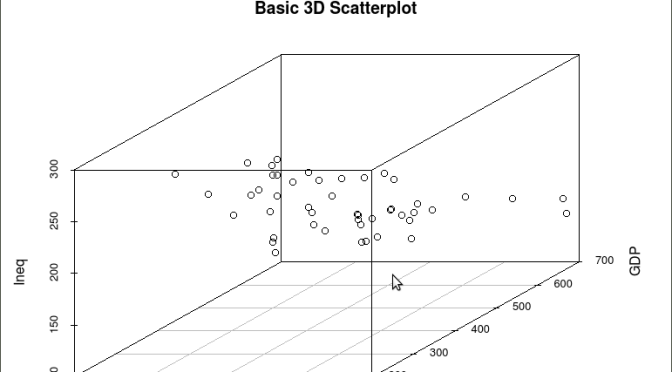
As is often the case in behavioral research we want to evaluate models that involve more than two variables. For multivariate models scatter plots can be generated using a 3 dimensional version of the R plot() function. For the above model we can add a third variable ‘Ineq’ from the dataset which is a measure the distribution of wealth in the population. Since we are now working with a multivariate linear model of the form ‘y = b1(x1) + b2(x2) + a’ we can use the R function scatterplot3d() to generate a 3 dimensional representation of the variables.

Once again we use the MASS package and the dataset  ‘UScrime’ for the graph data. The code is seen below:

####################################################
## create a 3d graph using the variables y, GDP, and Ineq
####################################################
#
library(scatterplot3d)   ##load scatterplot3d function
require(MASS)
attach(UScrime)   ## use data from UScrime dataset
scatterplot3d(y,GDP, Ineq,
main=”Basic 3D Scatterplot”) ## graph 3 variables, y
#
###################################################

The following graph is produced:

screenshot-graphics-device-number-2-active-%27rkward%27

The above code will generate a basic 3d plot using default values. We can add straight lines from the plane of the graph to each of the data points by setting the graph type option as ‘type=”h”, as seen in the code below:

##############################################

require(MASS)
library(scatterplot3d)
attach(UScrime)
model <- scatterplot3d(GDP, Ineq, y,
type=”h”, ## add vertical lines from plane with this option
main=”3D Scatterplot with Vertical Lines”)
####################################################

This results in the graph:

screenshot-graphics-device-number-2-active-%27rkward%27-1

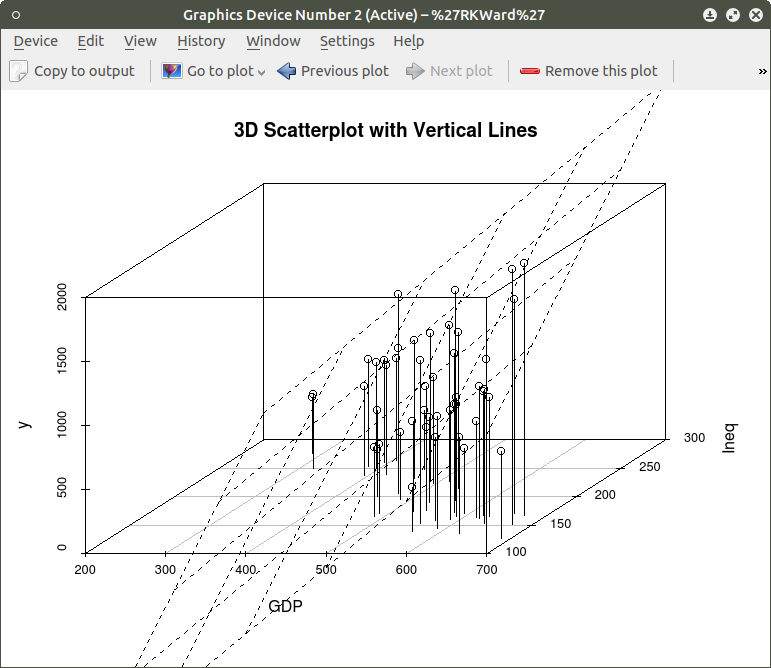
There are numerous options that can be used to go beyond the basic 3d plot. Refer to CRAN documentation to see these. A final addition to the 3d plot as discussed here is the code needed to generate the regression plane of our linear regression model using the y (crimerate), GDP, and Ineq variables. This is accomplished using the plane3d() option that will draw a plane through the data points of the existing plot. The code to do this is shown below:

##############################################
require(MASS)
library(scatterplot3d)
attach(UScrime)
model <- scatterplot3d(GDP, Ineq, y,
type=”h”,   ## add vertical line from plane to data points with this #option
main=”3D Scatterplot with Vertical Lines”)
## now calculate and add the linear regression data
model1 <- lm(y ~ GDP + Ineq)   #
model$plane3d(model1)   ## link the 3d scatterplot in ‘model’ to the ‘plane3d’ option with ‘model1’ regression information
#
####################################################

The resulting graph is:
screenshot-graphics-device-number-2-active-%27rkward%27-2

To draw a regression plane through the data points only change the ‘type’ option to ‘type=”p” to show the data points without vertical lines to the plane. There are also many other options that can be used. See the CRAN documentation to review them.

I have hopefully shown that relatively simple R code can be used to generate some informative and useful graphs. Once you start to become aware of how to use the multitude of options for these functions you can have virtually total control of the visual presentation of data. I will discuss some additional simple graphs in the next tutorial that I post.
R For Beginners: Some Simple R Code to do Common Statistical Procedures, Part Two


An R tutorial by D. M. Wiig

This posting contains an embedded Word document. To view the document full screen click on the icon in the lower right hand corner of the embedded document.


R For Beginners: Basic R Code for Common Statistical Procedures Part I


An R tutorial by D. M. Wiig

This section gives examples of code to perform some of the most common elementary statistical procedures. All code segments assume that the package ‘car’ has been loaded and the file ‘Freedman’ has been loaded as the active dataset. Use the menu from the R console to load the ’car’ dataset or use the following command line to access the CRAN site list and packages:


install.packages()

Once the ’car’ package has been downloaded and installed use the following command to make it the active library.

require(car)

Load the ‘Freedman’ data file from the dataset ‘car’

data(Freedman, package="car")

List basic descriptives of the variables:

summary(Freedman)

Perform a correlation between two variables using Pearson, Kendall or Spearman’s correlation:

cor(filename[,c("var1","var2")], use="complete.obs", method="pearson")

cor(filename[,c("var1","var2")], use="complete.obs", method="spearman")

cor(filename[,c("var1","var2")], use="complete.obs", method="kendall")

Example:

cor(Freedman[,c("crime","density")], use="complete.obs", method="pearson")

cor(Freedman[,c("crime","density")], use="complete.obs", method="kendall")

cor(Freedman[,c("crime","density")], use="complete.obs", method="spearman")

In the next post I will discuss basic code to produce multiple correlations and linear regression analysis.  See other tutorials on this blog for more R code examples for basic statistical analysis.


R Video Tutorial: Basic R Code to Load a Data File and Produce a Histogram


R For Beginners:  Some Simple R Code to Load a Data File and Produce a Histogram

A tutorial by D. M. Wiig

I have found that a good method for learning how to write R code is to examine complete code segments written to perform specific tasks and to modify these procedures to fit your specific needs. Trying to master R code in the abstract by reading a book or manual can be informative but is more often confusing.  Observing what various code segments do by observing the results allows you to learn with hands-on additions and modifications as needed for your purposes.

In this document I have included a short video tutorial that discusses  loading a dataset from the R library, examining the contents of the dataset and selecting one of the variables to examine using a basic histogram.  I have included an annotated code chunk of the procedures discussed in the video.

The video appears below with the code segment following.

Here is the annotated code used in the video:

###################################
#use the dataset mtcars from the ‘datasets’ package
#select the variable mpg to do a histogram
#show a frequency distribution of the scores
##########################################
#library is ‘datasets’
#########################################
library(“datasets”)
#########################################
#take a look at what is in ‘datasets’
#########################################
library(help=”datasets”)
#######################################
#take a look at the ‘mtcars’ data
#########################################
View(mtcars)
#######################################
#now do a basic histogram with the hist function
###########################################
hist(mtcars$mpg)
#############################################
#dress up the graph; not covered in the video but easy to do
############################################
hist(mtcars$mpg, col=”red”, xlab = “Miles per Gallon”, main = “Basic Histogram Using ‘mtcars’ Data”)
###################################################


R For Beginners: A Video Tutorial on Installing and Using the Deducer Statistics Package


R For Beginners:  A Video Tutorial on Installing and Using the Deducer Statistics Package with the R Console

In previous tutorials I have discussed the use of R Commander and Deducer statistical packages that provide a menu based GUI for R.  In this video tutorial I will discuss downloading and installing the Deducer statistics package.  This video is designed to support my previous tutorial on the same subject.

I have embedded the video below,   I hope you find this tutorial  a useful adjunct to installing and using the menu based Deducer package.

This document is an embedded Word document.  To view it full screen click on the icon in the lower right corner of the screen


R for Beginners: Using R Commander for Basic t Tests and One Way ANOVA


R for Beginners:  Using R Commander for Basic t Tests and One Way ANOVA

A tutorial by D. M. Wiig

This post is contained in an embedded Word document.  To read it full screen click on the icon in the lower right corner of the document window.

I hope that you found this tutorial informative.  Stop back by to check for new installments.  I have many currently in the writing stage.

R for Beginners: Using R Commander, Graphing and Correlation


A tutorial by Douglas M. Wiig

Please note that this post is an embedded Word document. To read the document full screen click on the icon in the lower right portion of the document window.

R For Beginners: Installing and Using the R Console in a Windows Environment


An R tutorial by D. M. Wiig

This tutorial is posted as an embedded Word document. To view the document full screen click on the icon in the lower-right corner of the document window.

My next post covering installing and using the Rcommander GUI will be out in a day or two.

Using R to Create Ternary Diagrams: An Example Using 2016 Presidential Polling Data


An R Tutorial by D. M. Wiig

In previous tutorials I have discussed the basics of creating a ternary plot using the ggtern package using a simple hypothetical data frame containing five values. In a subsequent tutorial I discussed the application by creating a ternary graph using election results from the British House of Commons from the last half of the 20th century. This type of plot creates a very nice visual of the effects of a third party on the election outcome.

In this tutorial I will discuss using the same technique as applied to recent polling data from the ongoing 2016 U.S. presidential campaign. Before discussing the current election campaign I am going to refresh your memory relative to using the ggtern package.

Before running the script in this tutorial make sure that the packages ggplot, ggplot2, and ggtern are loaded into your R environment. Please also note the you will need a recent version of R that is version 3.1.x or newer. A very basic graph can be easily constructed. I will the use theoretical quantities XA , XB , and XC to demonstrate a basic ternary diagram. In this simple example I will create a sample of n=5 by entering the data from the keyboard into a data frame ‘sampfile.’ To invoke the editor use the following code:

###################################################

#create a sample file of n=5

###################################################

sampfile <-data.frame(Xa=numeric(0),Xb=numeric(0),Xc=numeric(0))

sampfile <-edit(sampfile)

###################################################

This will open up a data entry sheet with three columns labeled Xa, Xb, and Xc. The number that are entered do not matter for purposes of this illustration. The table I entered is as follows:

Xa      Xb      Xc

1 100   135   250

2 90     122    210

3 98      44     256

4 100   97     89

5 90     75     89

To produce a very basic ternary diagram with the above data set use the code segment:

##################################################

#do basic graph with sample data

##################################################

ggtern(data=sampfile, aes(x=Xa,y=Xb, z=Xc)) + geom_point()

##################################################

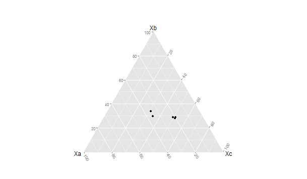
This produces the graph seen below:

A Simple Ternary Diagram


The triangular representation of the dimensions Xa →Xb, Xc → Xa and Xb →Xc allow each case to be represented as a single point located relative to each of the three vectors. There are a large number of additions, modifications and tweaks that can be done to this basic pattern. In the next tutorial I will discuss generating a more elaborate ternary diagram using polling data from the current U.S. presidential campaign.

Thu US has a two party dominant system with several minor parties that regularly contest elections. In the current presidential election campaign there are the two major party candidates as well as two minor party candidates for the Libertarian and Green parties that are being included in the numerous public opinion polls that are being done nationally.

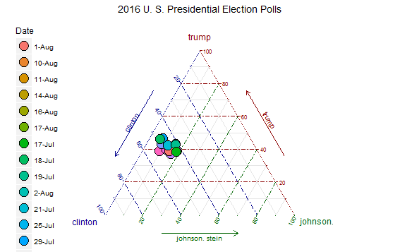
For purposes of this example I have added the percentages for these two minor parties together. This results in three variables that are being plotted, the percentage for Clinton (Democrat), Trump (Republican), and for the combined Johnson (Libertarian) and Stein (Green). By plotting the three variables over time on a ternary diagram we can visualize any changes in the mixture of support indicated for the candidates.

The poll data used in this project were taken from the web site RealClearPolitics.com for the time period from July 29 to August 18.¹ It should be noted that the poll numbers were not necessarily from the same polling organization for each date but all polls used were listed as being national in scope with a Clinton v. Trump v. Johnson v. Stein format.

Before working through this tutorial make sure that you have the ggplot, ggplot2, and ggtern packages loaded into your R environment.² I originally created the table shown above using Excel and then converted it into a *cvs format before importing it into R studio for analysis.³ The data can be entered directly via the R data editor as shown in the previous example. The code segment below was used to load the *csv format file:

####################################################Enter data into spreadsheet and save a a *csv file

#Load the data into a table using the read.table function

polldata <- read.table(“d:/16electiondata.csv”, header = TRUE, sep=”,”)

#Make sure the table is ok

View(polldata)

###################################################

date                 clinton trump johnson/stein
17-Aug              41          35                  10
16-Aug              43          37                  15
14-Aug              42          37                  12
11-Aug              43          40                  10
10-Aug              44         40                   13
9-Aug                 44         38                   14
8-Aug                 50         37                     9
7-Aug                 45         37                   12
5-Aug                 39         35                   17
4-Aug                 43         34                   15
2-Aug                 42         38                   13
1-Aug                 45         37                   14
30-Jul                46          41                    8
29-Jul                37          37                    6
25-Jul                39          41                   15
21-Jul                38          35                    0
19-Jul                39          40                   15
18-Jul                45          43                    6
17-Jul                42          37                   18

Once the data set is loaded use the following code to create the ternary diagram. Note that in this diagram we are using the base code as shown in the first tutorial with some additions that make the diagram easier to interpret such as the vector arrows and legend. The code segment is:

###################################################

#create ternary plot using percentage polled for each candidate for each polling period

#uses enhanced formatting for easier interpretation

#results of ggtern function are placed in variable ‘plot’ for rendering

###################################################

plot <- ggtern(data = polldata, aes(x = clinton, y = trump, z = johnson.stein)) +

geom_point(aes(fill = date),


size = 6,

shape = 21,

color = “black”) +

ggtitle(“2016 U.S. Presidential Election Polls”) +

labs(fill = “Date”) +

theme_rgbw() +

theme(legend.position = c(0,1),

legend.justification = c(1, 1))

###################################################

To show the diagram simply use:

###################################################

#now plot the diagram

###################################################

plot

###################################################

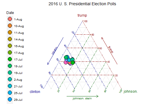
The resulting ternary diagram is:

2016ternplot

Each point on the graph represents the percentage of support for each of the three candidates by the location of the point on the 3-way graph axes. This R routine provides a quick and straightforward method for representing a 3-dimensional relationship in two dimensions.

Code segments in this article were written using R Studio Version 0.98.993 running R version 3.1.1  in a Windows 7 environment.

Notes:

¹As indicated above the poll data used in this tutorial was located at http://realclearpolitics.com. This website is an excellent source of information about all aspects of American electoral politics.

² For additional information about ternary graphs see the website http://www.ggtern.com. See also the CRAN website at http://cran.r-project.org/web/packages/ggtern/ggtern.pdf.

³For information about using the IDE R Studio see the website https://www.rstudio.com

Using R to Create Ternary Graphs


I am currently working on an updated posting of my tutorial
Ternary Diagrams Using R: An Example Using Election Outcomes.

The new tutorial will explore using ternary diagrams to track shifts in support for presidential candidates in the 2016 US presidential campaign.

Check back soon for the first installment!