Visual Representation of Text Data Sets Using the R tm and wordcloud Packages: Part One
Douglas M. Wiig
This paper is the next installment in series that examines the use of R scripts to present and analyze complex data sets using various types of visual representations. Previous papers have discussed data sets containing a small number of cases and many variable, and data sets with a large number of cases and many variables. The previous tutorials have focused on data sets that were numeric. In this tutorial I will discuss some uses of the R packages tm and wordcloud to meaningfully display and analyze data sets that are composed of text. These types of data sets include formal addresses, speeches, web site content, Twitter posts, and many other forms of text based communication.
I will present basic R script to process a text file and display the frequency of significant words contained in the text. The results include a visual display of the words using the size of the font to indicate the relative frequency of the word. This approach displays increasing font size as specific word frequency increases. This type of visualization of data is generally referred to as a "wordcloud." To illustrate the use of this approach I will produce a wordcloud that contains the text from the 2017 Presidental State of the Union Address.
There are generally four steps involved in creating a wordcloud. The first step involves loading the selected text file and required packages into the R environment. In the second step the text file is converted into a corpus file type and is cleaned of unwanted text, punctuation and other non-text characters. The third step involves processing the cleaned file to determine word frequencies, and in the fourth step the wordcloud graphic is created and displayed.
Installing Required Packages
As discussed in previous tutorials I would highly recommend the use of an IDE such as RStudio when composing R scripts. While it is possible to use the basic editor and package loader that is part of the R distribution, an IDE will give you a wealth of tools for entering, editing, running, and debugging script. While using RStudio to its fullest potential has a fairly steep learning curve, it is relatively easy to successfully navigate and produce less complex R projects such as this one.
Before moving to the specific code for this project run a list of all of the packages that are loaded when R is started. If you are using RStudio click on the "Packages" tab in the lower right quadrant of the screen and look through the list of packages. If you are using the basic R script editor and package loader, at the command prompt use the following command:
#####################################################################################
>installed.packages()
#####################################################################################
The command produces a list of all currently installed packages. Depending on the specific R version that you are using the packages for this project may or may not be loaded and available. I will assume that they will need to be installed. The packages to be loaded are tm, wordcloud, tidyverse, readr, and RColorBrewer. Use the following code:
#############################################################################
#Load required packages
#############################################################################
install.packages("tm") #processes data
install.packages("wordcloud") #creates visual plot
install.packages("tidyverse") #graphics utilities
install.packages("readr") #to load text files
install.packages("RColorBrewer") #for color graphics
#############################################################################
Once the packages are installed the raw text file can be loaded. The complete text of Presidential State of the Union Addresses can be readily accessed on the government web site https://www.govinfo.gov/features/state-of-the-union. The site has sets of complete text for various years that can be downloaded in several formats. For this project I used the 2017 State of the Union downloaded in text format. To load and view the raw text file in the R environment use the "Import Dataset" tab in the upper right quadrant of RStudio or the code below:
#############################################################################
library(readr)
yourdatasetname <- read_table2("path to your data file", col_names = FALSE)
View(dataset)
#############################################################################
Processing The Data
The goal of this step is to produce the word frequencies that will be used by wordcloud to create the wordcloud graphic display. This process entails converting the raw text file into a corpus format, cleaning the file of unwanted text, converting the cleaned file to a text matrix format, and producing the word frequency counts to be graphed. The code below accomplishes these tasks. Follow the comments for a description of each step involved.
###########################################################################
#Take raw text file statu17 and convert to corpus format named docs17
###########################################################################
library(tm)
docs17 <- Corpus(VectorSource(statu17))
###########################################################################
###########################################################################
#Clean punctuation, stopwords, white space
#Three passes create corpus vector source from original file
#A corpus is a collection of text
###########################################################################
library(tm)
library(wordcloud)
data(docs17)
docs17 <- tm_map(docs17,removePunctuation) #remove punctuation
docs17 <- tm_map(docs17,removeWords,stopwords("english")) #remove stopwords
docs17 <- tm_map(docs17,stripWhitespace) #remove white space
###########################################################################
#Cleaned corpus is now formatted into text document matrix
#Then frequency count done for each word in matrix
#dmat <-create matrix; dval <-sort; dframe <-count word frequencies
#docmat <- converts cleaned corpus to text matrix for processing
###########################################################################
docmat <- TermDocumentMatrix(docs17)
dmat <- as.matrix(docmat)
dval <- sort(rowSums(dmat),decreasing=TRUE)
dframe <- data.frame(word=names(dval),freq=dval)
###########################################################################
Once these steps have been completed the data frame "dframe" will now be used by the wordcloud package to produce the graphic.
Producing the Wordcloud Graphic
We are now ready to produce the graphic plot of word frequencies. The resulting display can be manipulated using a number of settings including color schemes, number of words displayed, size of the wordcloud, minimum word frequency of words to display, and many other factors. Refer to Appendix B for additional information.
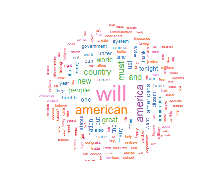
For this project I have chosen to use a white background and a multi-colored word display. The display is medium size, with 150 words maximum, and a minimum word frequency of two. The resulting graphic is shown in Figure 1. Use the code below to produce and display the wordcloud:
##########################################################################################
#Final step is to use wordcloud to generate graphics
#There are a number of options that can be set
#See Appendix for details
#Use RColorBrewer to generate a color wordcloud
#RColorBrewer has many options, see Appendix for details
##########################################################################################
library(RColorBrewer)
set.seed(1234) #use if random.color=TRUE
par(bg="white") #background color
wordcloud(dframe$word,dframe$freq,colors=brewer.pal(8,"Set1"),random.order=FALSE,
scale=c(2.75,0.20),min.freq=2,max.words=150,rot.per=0.35)
##########################################################################################
 As seen above, the wordcloud display is arranged in a manner with the most frequently used words in the largest font at the center of the graph. As word frequency drops there are somewhat concentric rings of words in smaller and smaller fonts with the smallest font outer rings set by the wordcloud parameter min.freq=2. At this point I will leave an analysis of the wordcloud to the interpretation of the reader.
In part two of this tutorial I will discuss further use of the wordcloud package to produce comparison wordclouds using SOTU text files from 2017, 2018, 2019, and 2020. I will also introduce part three of the tutorial which will discuss using wordcloud with very large text data sets such as Twitter posts.
Appendix A: Resources and References
This section contains links and references to resources used in this project. For further information on specific R packages see the links below.
Package tm:
https://cran.r-project.org/web/packages/tm/tm.pdf
Package RColorBrewer:
https://cran.r-project.org/web/packages/RColorBrewer/RColorBrewer.pdf
Package readr:
https://cran.r-project.org/web/packages/readr/readr.pdf
Package wordcloud:
https://cran.r-project.org/web/packages/wordcloud/wordcloud.pdf
Package tidyverse
https://cran.r-project.org/web/packages/tidyverse/tidyverse.pdf
To download the RStudio IDE:
https://www.rstudio.com/products/rstudio/download
General works relating to R programming:
Robert Kabacoff, R in Action: Data Analysis and Graphics With R, Sheleter Island, NY: Manning Publications, 2011.
N.D. Lewis, Visualizing Complex Data in R, N.D. Lewis, 2013.
The text data for the 2017 State of the Union Address was downloaded from:
https://www.govinfo.gov/features/state-of-the-union
Appendix B: R Functions Syntax Usage
This appendix contains the syntax usage for the main R functions used in this paper. See the links in Appendix A for more detail on each function.
readr:
read_table2(file,col_names = TRUE,col_types = NULL,locale = default_locale(),na = "NA",
skip = 0,n_max = Inf,guess_max = min(n_max, 1000),progress = show_progress(),comment = "",
skip_empty_rows = TRUE)
wordcloud:
wordcloud(words,freq,scale=c(4,.5),min.freq=3,max.words=Inf,
random.order=TRUE, random.color=FALSE, rot.per=.1,
colors="black",ordered.colors=FALSE,use.r.layout=FALSE,
fixed.asp=TRUE, ...)
rcolorbrewer:
brewer.pal(n, name)
display.brewer.pal(n, name)
display.brewer.all(n=NULL, type="all", select=NULL, exact.n=TRUE,colorblindFriendly=FALSE)
brewer.pal.info
tm:
tm_map(x, FUN, ...)
All R programming for this project was done using RStudio Version 1.2.5033
The PDF version of this document was produced using TeXstudio 2.12.6
Author: Douglas M. Wiig 4/01/2021
Web Site: http://dmwiig.net
Click the links below to open the PDF version of this post.
As seen above, the wordcloud display is arranged in a manner with the most frequently used words in the largest font at the center of the graph. As word frequency drops there are somewhat concentric rings of words in smaller and smaller fonts with the smallest font outer rings set by the wordcloud parameter min.freq=2. At this point I will leave an analysis of the wordcloud to the interpretation of the reader.
In part two of this tutorial I will discuss further use of the wordcloud package to produce comparison wordclouds using SOTU text files from 2017, 2018, 2019, and 2020. I will also introduce part three of the tutorial which will discuss using wordcloud with very large text data sets such as Twitter posts.
Appendix A: Resources and References
This section contains links and references to resources used in this project. For further information on specific R packages see the links below.
Package tm:
https://cran.r-project.org/web/packages/tm/tm.pdf
Package RColorBrewer:
https://cran.r-project.org/web/packages/RColorBrewer/RColorBrewer.pdf
Package readr:
https://cran.r-project.org/web/packages/readr/readr.pdf
Package wordcloud:
https://cran.r-project.org/web/packages/wordcloud/wordcloud.pdf
Package tidyverse
https://cran.r-project.org/web/packages/tidyverse/tidyverse.pdf
To download the RStudio IDE:
https://www.rstudio.com/products/rstudio/download
General works relating to R programming:
Robert Kabacoff, R in Action: Data Analysis and Graphics With R, Sheleter Island, NY: Manning Publications, 2011.
N.D. Lewis, Visualizing Complex Data in R, N.D. Lewis, 2013.
The text data for the 2017 State of the Union Address was downloaded from:
https://www.govinfo.gov/features/state-of-the-union
Appendix B: R Functions Syntax Usage
This appendix contains the syntax usage for the main R functions used in this paper. See the links in Appendix A for more detail on each function.
readr:
read_table2(file,col_names = TRUE,col_types = NULL,locale = default_locale(),na = "NA",
skip = 0,n_max = Inf,guess_max = min(n_max, 1000),progress = show_progress(),comment = "",
skip_empty_rows = TRUE)
wordcloud:
wordcloud(words,freq,scale=c(4,.5),min.freq=3,max.words=Inf,
random.order=TRUE, random.color=FALSE, rot.per=.1,
colors="black",ordered.colors=FALSE,use.r.layout=FALSE,
fixed.asp=TRUE, ...)
rcolorbrewer:
brewer.pal(n, name)
display.brewer.pal(n, name)
display.brewer.all(n=NULL, type="all", select=NULL, exact.n=TRUE,colorblindFriendly=FALSE)
brewer.pal.info
tm:
tm_map(x, FUN, ...)
All R programming for this project was done using RStudio Version 1.2.5033
The PDF version of this document was produced using TeXstudio 2.12.6
Author: Douglas M. Wiig 4/01/2021
Web Site: http://dmwiig.net
Click the links below to open the PDF version of this post.
Tag Archives: r graphics

An R Tutorial: Visual Representation of Complex Multivariate Relationships Using the R qgraph Package, Part Two Repost
This is a repost of the original article that was posted as an embedded PDF file.
Douglas M. Wiig
April 8, 2018
Abstract
This article is part of my series of articles exploring the use of R
packages that allow for visualization of complex relationships among variables.
Other articles have examined visual representations produced by
the qgraph package in both large and small samples with more than three
variables. In this article I look specifically at the R qgraph package with a small
dataset of N=10, but a large number (14) of variables. Specifically, the R
qgraph.pca function is examined.
1 The Problem
In two previous blog posts I discussed some techniques for visualizing relationships
involving two or three variables and a large number of cases. In this
tutorial I will extend that discussion to show some techniques that can be used
on datasets with complex multivariate relationships involving three or more
variables.
In this post I will use a dataset called ‘Detroit.’ This data set was originally
used in the book ‘Subset selection in regression’ by Alan J. Miller published in
the Chapman and Hall series of monographs on Statistics and Applied Probability,
no. 40. It was also used in other research and appeared in appendix A
of ‘Regression analysis and its application: A data-oriented approach’ by Gunst
and Mason, Statistics textbooks and monographs no. 24, Marcel Dekker. Editor.
The Detroit dataset contains 14 variables and 10 cases. Each case represents
a year during the time period 1961-1973. The variables on which data was
collected are seen as possible predictors of homicide rate in Detroit during each
of the years studied.
These data are shown below
FTP UEMP MAN LIC GR CLEAR WM NMAN GOV HE WE HOM ACC ASR
260.35 11.0 455.5 178.15 215.98 93.4 558724. 538.1 133.9 2.98 117.18 8.60 9.17 306.18
269.80 7.0 480.2 156.41 180.48 88.5 538584. 547.6 137.6 3.09 134.02 8.90 40.27 315.16
272.04 5.2 506.1 198.02 209.57 94.4 519171. 562.8 143.6 3.23 141.68 8.52 45.31 277.53
272.96 4.3 535.8 222.10 231.67 92.0 500457. 591.0 150.3 3.33 147.98 8.89 49.51 234.07
272.51 3.5 576.0 301.92 297.65 91.0 482418. 626.1 164.3 3.46 159.85 13.0 55.05 30.84
261.34 3.2 601.7 391.22 367.62 87.4 465029. 659.8 179.5 3.60 157.19 14.57 53.90 17.99
268.89 4.1 577.3 665.56 616.54 88.3 448267. 686.2 187.5 3.73 155.29 21.36 50.62 86.11
295.99 3.9 596.9 1131.21 1029.75 86.1 432109. 699.6 195.4 2.91 131.75 28.03 51.47 91.59
319.87 3.6 613.5 837.60 786.23 79.0 416533. 729.9 210.3 4.25 178.74 31.49 49.16 20.39
341.43 7.1 569.3 794.90 713.77 73.9 401518. 757.8 223.8 4.47 178.30 37.39 45.80 23.03
The variables are as follows:
FTP – Full-time police per 100,000 population
UEMP – % unemployed in the population
MAN – number of manufacturing workers in thousands
LIC – Number of handgun licenses per 100,000 population
GR – Number of handgun registrations per 100,000 population
CLEAR – % homicides cleared by arrests
WM – Number of white males in the population
NMAN – Number of non-manufacturing workers in thousands
GOV – Number of government workers in thousands
HE – Average hourly earnings
WE – Average weekly earnings
HOM – Number of homicides per 100,000 of population
ACC – Death rate in accidents per 100,000 population
ASR – Number of assaults per 100,000 population
[J.C. Fisher ”Homicide in Detroit: The Role of Firearms”, Criminology, vol.14,
387-400 (1976)]
2 Analysis
As I have noted in previous tutorials, social science research projects often start
out with many potential independent predictor variables for a given dependent
variable. If these are all measured at the interval or ratio level, a correlation
matrix often serves as a starting point to begin analyzing relationships among
variables. In this particular case a researcher might be interested in looking at
factors that are related to total homicides. There are many R techniques to
enter data for analysis. In this case I entered the data into an Excel spreadsheet
and then loaded the file into the R environment. Install and load the following
packages:
Hmisc
stats
qgraph
readxl (only needed if importing data from Excel)
A correlation matrix can be generated using the cor function which is contained
in the stats package. To produce a matrix using all 14 variables use the
following code:
#the data file has been loaded as ’detroit’
#the file has 14 columns
#run a pearson correlation and #run a pearson correlation and put into the object ’detcor’
detcor=cor(as.matrix(detroit[c(1:14)]), method=”pearson”)
#
#round the correlation matrix to 2 decimal places for better viewing
round(detcor, 2)
#
#The resulting matrix will be displayed on the screen
Examination of the matrix shows a number of the predictors correlate with the
dependent variable ’HOM.’ There are also a large number of inter-correlations
among the predictor variables. This fact makes it difficult to make any generalizations
based on the correlation matrix only. As demonstrated in previous
tutorials, the qgraph function can be used to produce a visual representation of
the correlation matrix. Use the following code:
#basic graph with 14 vars zero order correlations
qgraph(detcor, shape=”circle”, posCol=”darkgreen”, negCol=”darkred”, layout=”spring”)
This will produce graph as seen below:
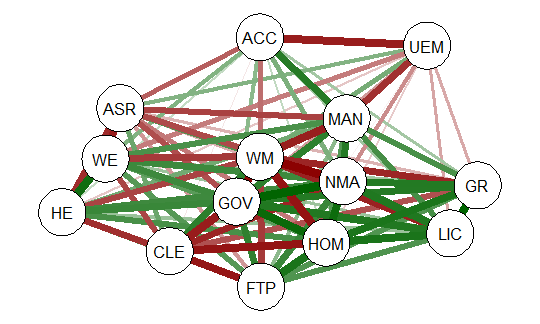
The graph displays positive correlations among variable as a green line, and
negative as a red line. The color intensity indicates the relative strength of the
correlation. While this approach provides an improvement over the raw matrix
it still rather difficult to interpret. There are many options other than those
used in the above example that allow qgraph to have a great deal of flexibility in
creating visual representation of complex relationships among variables. In the
next section I will examine one of these options that uses principal component
analysis of the data.
2.1 Using qgraph Principal Component Analysis
A discussion of the theory behind principal component exploratory analysis is
beyond the scope of this discussion. Suffice it to say that it allows for simplification
of a large number of inter-correlations by identifying factors or dimensions
that individual correlations relate to. This grouping of variables on specific factors
allows qgraph to create a visual representation of these relationships. An
excellent discussion of the theory of PCA along with R scripts can be found in
Principal Components Analysis (PCA), Steven M. Holland Department of Geology,
University of Georgia, Athens, GA, 2008.
To produce a graph using the ’detcor’ correlation matrix used above use the
following code:
#correlation matrix used is ’detcor’
#qgraph with loadings from principal components
#basic options used; many other options available
qgraph.pca(detcor, factor=3, rotation=”varimax”)
#this will yield 3 factors
This code produces the output shown below:
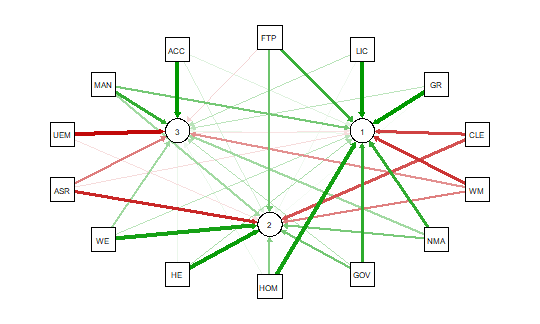
As noted above the red and green arrows indicate negative and positive loadings
on the factors, and the color intensity indicates the strength. The qgraph.pca
function produces a useful visual interpretation of the clustering of variables relative
to the three factors extracted. This would be very difficult if not impossible
with only the correlation matrix or the basic qgraph visual representation.
In a future tutorial I will explore more qgraph options that can be used to
explore the Detroit dataset as well as options for a larger datasets. In future
articles I will also explore other R packages that are also useful for analyzing
large numbers of complex variable interrelationships in very large, medium, and
small samples.
** When developing R code I strongly recommend using an IDE such as
RStudio. This is a powerful coding environment and is free for personal use as
well as being open source software. RStudio will run on a variety of platforms.
If you are developing code for future publication or sharing I would also recommend
TeXstudio, a LaTex based document development environment which is also free for personal use. This document was produced using TeXstudio 2.12.6
and RStudio 1.0.136.

Ternary Diagrams Using R: An Example Using Election Outcomes
Ternary Diagrams Using R: An Example Using Election Outcomes
A tutorial by D. M. Wiig
In part one of this tutorial I discussed creating a ternary diagram using a simple data frame that contained five hypothetical cases. In this tutorial I will expand on that foundation by creating a more informative ternary diagram using live data.
A useful application of this package in social science research is creating a visual display of parliamentary election outcomes. Specifically we can use a ternary graph to examine the distribution of seats in the British House of Commons over a period of time. Since the UK uses a proportional system to allocate seats in the House of Commons there can be a variety of outcomes in any given national election.
Since 1945 general elections in the UK have produced a division of seats among the Labour, Conservative, and various minor parties. To demonstrate how this division of seats can be shown over time data was collected for all of the general elections from the years 1945 to 2015. These data show the percentage of the popular vote won by each party and the number of seats allocated to that party based on the vote division(retrieved from http://www.ukpolitical.info). I have created a summary table of these results as follows:
Year Con Lab LD+Other SeatsCon SeatsLab SeatsOther
2015 36.9 30.4 32.7 331 232 95
2010 36.1 29 34.9 306 258 85
2005 35.2 32.4 32.4 355 198 92
2001 40.7 31.7 27.6 412 166 81
1997 43.2 30.7 26.1 418 165 76
1992 42.3 35.2 23.5 336 271 44
1987 42.2 30.8 27 375 229 48
1983 42.4 27.6 26.9 397 209 27
1979 43.9 36.9 15.8 339 268 28
1974 39.2 35.8 21.8 319 276 39
1974 37.1 37.9 20.1 301 296 38
1970 46.4 43 8.6 330 287 19
1966 47.9 41.9 8.5 363 253 25
1964 44.1 53.4 11.2 317 304 22
1959 49.4 43.8 5.9 365 258 19
1955 49.7 46.4 0 344 277 18
1951 48 48.8 2.5 321 295 18
1950 46.1 43.5 9.1 315 297 22
1945 47.8 39.8 1 393 213 57
The UK has a two party dominant system with a number of minor parties that regularly contest elections. As indicated above, a proportional representation method of allocating seats is used so these minor parties are able to gain some representation in the Commons. For readers interested in learning more about political parties in the UK there are a number of resources readily available at various online and other sources.
For purposes of this example I have added the popular vote of all minor parties together in the ‘LD+Other’ column, and the number of seats gained in the ‘SeatsOther’ column. By plotting the three variables ‘SeatsCon’, ‘SeatsLab’, and ‘SeatsOther’ by year on a ternary diagram we can visualize any changes in the mixture of seats won for the three groups. Before working through this tutorial make sure that you have the ggplot, ggplot2, and ggtern packages loaded into your R environment.
I originally created the table shown above using Excel and then imported it into R studio for analysis. If you are not using R studio you can enter the data via the R data editor as shown in the previous tutorial, or put the data into an Excel or LibreOffice spreadsheet and import it into R using the read.spss() function that I have discussed in earlier tutorials. You can also use any other method that you are familiar with to get the data into your R environment.
Once the data set is loaded use the following code to create the ternary diagram. Note that in this diagram we are using the base code as shown in the first tutorial with some additions that make the diagram easier to interpret such as the vector arrows and legend. The code segment is:
################################################### #create ternary plot using seats allocated by party for each election #uses enhanced formatting for easier interpretation #results of #ggtern function are placed in ‘plot for rendering ################################################### plot <- ggtern(data = ukvotedata, aes(x = SeatsCon, y = SeatsLab, z = SeatsOther)) +geom_point(aes(fill = Year), size = 4, shape = 21, color = “black”) + ggtitle(“Proportion of Seats Won 1945-2015”) + labs(fill = “Year”) + theme_rgbw() + theme(legend.position = c(0,1), legend.justification = c(0, 1)) ###################################################
To show the diagram simply use:
################################################### #now plot the diagram ################################################### plot ###################################################
The resulting ternary diagram is:

Each point on the graph represent the relative division of seats for each of the 19 elections in the table. The shading represents the year with the darkest being 1945 and the lightest 2015. The diagram clearly shows the trend toward more minor party representation and a move away from the two major parties over time. Indeed coalition governments resulted in several of the more recent elections due to the increase in minor party influence.
My purpose here is not to discuss UK politics but to show how ternary diagrams can be used in a social science application. With the many additions and extensions that are being added to the ggtern package it can be a very power device for graphical analysis.
