Visual Representation of Text Data Sets Using the R tm and wordcloud Packages: Part One
Douglas M. Wiig
This paper is the next installment in series that examines the use of R scripts to present and analyze complex data sets using various types of visual representations. Previous papers have discussed data sets containing a small number of cases and many variable, and data sets with a large number of cases and many variables. The previous tutorials have focused on data sets that were numeric. In this tutorial I will discuss some uses of the R packages tm and wordcloud to meaningfully display and analyze data sets that are composed of text. These types of data sets include formal addresses, speeches, web site content, Twitter posts, and many other forms of text based communication.
I will present basic R script to process a text file and display the frequency of significant words contained in the text. The results include a visual display of the words using the size of the font to indicate the relative frequency of the word. This approach displays increasing font size as specific word frequency increases. This type of visualization of data is generally referred to as a "wordcloud." To illustrate the use of this approach I will produce a wordcloud that contains the text from the 2017 Presidental State of the Union Address.
There are generally four steps involved in creating a wordcloud. The first step involves loading the selected text file and required packages into the R environment. In the second step the text file is converted into a corpus file type and is cleaned of unwanted text, punctuation and other non-text characters. The third step involves processing the cleaned file to determine word frequencies, and in the fourth step the wordcloud graphic is created and displayed.
Installing Required Packages
As discussed in previous tutorials I would highly recommend the use of an IDE such as RStudio when composing R scripts. While it is possible to use the basic editor and package loader that is part of the R distribution, an IDE will give you a wealth of tools for entering, editing, running, and debugging script. While using RStudio to its fullest potential has a fairly steep learning curve, it is relatively easy to successfully navigate and produce less complex R projects such as this one.
Before moving to the specific code for this project run a list of all of the packages that are loaded when R is started. If you are using RStudio click on the "Packages" tab in the lower right quadrant of the screen and look through the list of packages. If you are using the basic R script editor and package loader, at the command prompt use the following command:
#####################################################################################
>installed.packages()
#####################################################################################
The command produces a list of all currently installed packages. Depending on the specific R version that you are using the packages for this project may or may not be loaded and available. I will assume that they will need to be installed. The packages to be loaded are tm, wordcloud, tidyverse, readr, and RColorBrewer. Use the following code:
#############################################################################
#Load required packages
#############################################################################
install.packages("tm") #processes data
install.packages("wordcloud") #creates visual plot
install.packages("tidyverse") #graphics utilities
install.packages("readr") #to load text files
install.packages("RColorBrewer") #for color graphics
#############################################################################
Once the packages are installed the raw text file can be loaded. The complete text of Presidential State of the Union Addresses can be readily accessed on the government web site https://www.govinfo.gov/features/state-of-the-union. The site has sets of complete text for various years that can be downloaded in several formats. For this project I used the 2017 State of the Union downloaded in text format. To load and view the raw text file in the R environment use the "Import Dataset" tab in the upper right quadrant of RStudio or the code below:
#############################################################################
library(readr)
yourdatasetname <- read_table2("path to your data file", col_names = FALSE)
View(dataset)
#############################################################################
Processing The Data
The goal of this step is to produce the word frequencies that will be used by wordcloud to create the wordcloud graphic display. This process entails converting the raw text file into a corpus format, cleaning the file of unwanted text, converting the cleaned file to a text matrix format, and producing the word frequency counts to be graphed. The code below accomplishes these tasks. Follow the comments for a description of each step involved.
###########################################################################
#Take raw text file statu17 and convert to corpus format named docs17
###########################################################################
library(tm)
docs17 <- Corpus(VectorSource(statu17))
###########################################################################
###########################################################################
#Clean punctuation, stopwords, white space
#Three passes create corpus vector source from original file
#A corpus is a collection of text
###########################################################################
library(tm)
library(wordcloud)
data(docs17)
docs17 <- tm_map(docs17,removePunctuation) #remove punctuation
docs17 <- tm_map(docs17,removeWords,stopwords("english")) #remove stopwords
docs17 <- tm_map(docs17,stripWhitespace) #remove white space
###########################################################################
#Cleaned corpus is now formatted into text document matrix
#Then frequency count done for each word in matrix
#dmat <-create matrix; dval <-sort; dframe <-count word frequencies
#docmat <- converts cleaned corpus to text matrix for processing
###########################################################################
docmat <- TermDocumentMatrix(docs17)
dmat <- as.matrix(docmat)
dval <- sort(rowSums(dmat),decreasing=TRUE)
dframe <- data.frame(word=names(dval),freq=dval)
###########################################################################
Once these steps have been completed the data frame "dframe" will now be used by the wordcloud package to produce the graphic.
Producing the Wordcloud Graphic
We are now ready to produce the graphic plot of word frequencies. The resulting display can be manipulated using a number of settings including color schemes, number of words displayed, size of the wordcloud, minimum word frequency of words to display, and many other factors. Refer to Appendix B for additional information.
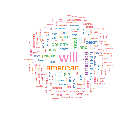
For this project I have chosen to use a white background and a multi-colored word display. The display is medium size, with 150 words maximum, and a minimum word frequency of two. The resulting graphic is shown in Figure 1. Use the code below to produce and display the wordcloud:
##########################################################################################
#Final step is to use wordcloud to generate graphics
#There are a number of options that can be set
#See Appendix for details
#Use RColorBrewer to generate a color wordcloud
#RColorBrewer has many options, see Appendix for details
##########################################################################################
library(RColorBrewer)
set.seed(1234) #use if random.color=TRUE
par(bg="white") #background color
wordcloud(dframe$word,dframe$freq,colors=brewer.pal(8,"Set1"),random.order=FALSE,
scale=c(2.75,0.20),min.freq=2,max.words=150,rot.per=0.35)
##########################################################################################
 As seen above, the wordcloud display is arranged in a manner with the most frequently used words in the largest font at the center of the graph. As word frequency drops there are somewhat concentric rings of words in smaller and smaller fonts with the smallest font outer rings set by the wordcloud parameter min.freq=2. At this point I will leave an analysis of the wordcloud to the interpretation of the reader.
In part two of this tutorial I will discuss further use of the wordcloud package to produce comparison wordclouds using SOTU text files from 2017, 2018, 2019, and 2020. I will also introduce part three of the tutorial which will discuss using wordcloud with very large text data sets such as Twitter posts.
Appendix A: Resources and References
This section contains links and references to resources used in this project. For further information on specific R packages see the links below.
Package tm:
https://cran.r-project.org/web/packages/tm/tm.pdf
Package RColorBrewer:
https://cran.r-project.org/web/packages/RColorBrewer/RColorBrewer.pdf
Package readr:
https://cran.r-project.org/web/packages/readr/readr.pdf
Package wordcloud:
https://cran.r-project.org/web/packages/wordcloud/wordcloud.pdf
Package tidyverse
https://cran.r-project.org/web/packages/tidyverse/tidyverse.pdf
To download the RStudio IDE:
https://www.rstudio.com/products/rstudio/download
General works relating to R programming:
Robert Kabacoff, R in Action: Data Analysis and Graphics With R, Sheleter Island, NY: Manning Publications, 2011.
N.D. Lewis, Visualizing Complex Data in R, N.D. Lewis, 2013.
The text data for the 2017 State of the Union Address was downloaded from:
https://www.govinfo.gov/features/state-of-the-union
Appendix B: R Functions Syntax Usage
This appendix contains the syntax usage for the main R functions used in this paper. See the links in Appendix A for more detail on each function.
readr:
read_table2(file,col_names = TRUE,col_types = NULL,locale = default_locale(),na = "NA",
skip = 0,n_max = Inf,guess_max = min(n_max, 1000),progress = show_progress(),comment = "",
skip_empty_rows = TRUE)
wordcloud:
wordcloud(words,freq,scale=c(4,.5),min.freq=3,max.words=Inf,
random.order=TRUE, random.color=FALSE, rot.per=.1,
colors="black",ordered.colors=FALSE,use.r.layout=FALSE,
fixed.asp=TRUE, ...)
rcolorbrewer:
brewer.pal(n, name)
display.brewer.pal(n, name)
display.brewer.all(n=NULL, type="all", select=NULL, exact.n=TRUE,colorblindFriendly=FALSE)
brewer.pal.info
tm:
tm_map(x, FUN, ...)
All R programming for this project was done using RStudio Version 1.2.5033
The PDF version of this document was produced using TeXstudio 2.12.6
Author: Douglas M. Wiig 4/01/2021
Web Site: http://dmwiig.net
Click the links below to open the PDF version of this post.
As seen above, the wordcloud display is arranged in a manner with the most frequently used words in the largest font at the center of the graph. As word frequency drops there are somewhat concentric rings of words in smaller and smaller fonts with the smallest font outer rings set by the wordcloud parameter min.freq=2. At this point I will leave an analysis of the wordcloud to the interpretation of the reader.
In part two of this tutorial I will discuss further use of the wordcloud package to produce comparison wordclouds using SOTU text files from 2017, 2018, 2019, and 2020. I will also introduce part three of the tutorial which will discuss using wordcloud with very large text data sets such as Twitter posts.
Appendix A: Resources and References
This section contains links and references to resources used in this project. For further information on specific R packages see the links below.
Package tm:
https://cran.r-project.org/web/packages/tm/tm.pdf
Package RColorBrewer:
https://cran.r-project.org/web/packages/RColorBrewer/RColorBrewer.pdf
Package readr:
https://cran.r-project.org/web/packages/readr/readr.pdf
Package wordcloud:
https://cran.r-project.org/web/packages/wordcloud/wordcloud.pdf
Package tidyverse
https://cran.r-project.org/web/packages/tidyverse/tidyverse.pdf
To download the RStudio IDE:
https://www.rstudio.com/products/rstudio/download
General works relating to R programming:
Robert Kabacoff, R in Action: Data Analysis and Graphics With R, Sheleter Island, NY: Manning Publications, 2011.
N.D. Lewis, Visualizing Complex Data in R, N.D. Lewis, 2013.
The text data for the 2017 State of the Union Address was downloaded from:
https://www.govinfo.gov/features/state-of-the-union
Appendix B: R Functions Syntax Usage
This appendix contains the syntax usage for the main R functions used in this paper. See the links in Appendix A for more detail on each function.
readr:
read_table2(file,col_names = TRUE,col_types = NULL,locale = default_locale(),na = "NA",
skip = 0,n_max = Inf,guess_max = min(n_max, 1000),progress = show_progress(),comment = "",
skip_empty_rows = TRUE)
wordcloud:
wordcloud(words,freq,scale=c(4,.5),min.freq=3,max.words=Inf,
random.order=TRUE, random.color=FALSE, rot.per=.1,
colors="black",ordered.colors=FALSE,use.r.layout=FALSE,
fixed.asp=TRUE, ...)
rcolorbrewer:
brewer.pal(n, name)
display.brewer.pal(n, name)
display.brewer.all(n=NULL, type="all", select=NULL, exact.n=TRUE,colorblindFriendly=FALSE)
brewer.pal.info
tm:
tm_map(x, FUN, ...)
All R programming for this project was done using RStudio Version 1.2.5033
The PDF version of this document was produced using TeXstudio 2.12.6
Author: Douglas M. Wiig 4/01/2021
Web Site: http://dmwiig.net
Click the links below to open the PDF version of this post.

An R Tutorial: Visual Representation of Complex Multivariate Relationships Using the R qgraph Package, Part Two Repost
This is a repost of the original article that was posted as an embedded PDF file.
Douglas M. Wiig
April 8, 2018
Abstract
This article is part of my series of articles exploring the use of R
packages that allow for visualization of complex relationships among variables.
Other articles have examined visual representations produced by
the qgraph package in both large and small samples with more than three
variables. In this article I look specifically at the R qgraph package with a small
dataset of N=10, but a large number (14) of variables. Specifically, the R
qgraph.pca function is examined.
1 The Problem
In two previous blog posts I discussed some techniques for visualizing relationships
involving two or three variables and a large number of cases. In this
tutorial I will extend that discussion to show some techniques that can be used
on datasets with complex multivariate relationships involving three or more
variables.
In this post I will use a dataset called ‘Detroit.’ This data set was originally
used in the book ‘Subset selection in regression’ by Alan J. Miller published in
the Chapman and Hall series of monographs on Statistics and Applied Probability,
no. 40. It was also used in other research and appeared in appendix A
of ‘Regression analysis and its application: A data-oriented approach’ by Gunst
and Mason, Statistics textbooks and monographs no. 24, Marcel Dekker. Editor.
The Detroit dataset contains 14 variables and 10 cases. Each case represents
a year during the time period 1961-1973. The variables on which data was
collected are seen as possible predictors of homicide rate in Detroit during each
of the years studied.
These data are shown below
FTP UEMP MAN LIC GR CLEAR WM NMAN GOV HE WE HOM ACC ASR
260.35 11.0 455.5 178.15 215.98 93.4 558724. 538.1 133.9 2.98 117.18 8.60 9.17 306.18
269.80 7.0 480.2 156.41 180.48 88.5 538584. 547.6 137.6 3.09 134.02 8.90 40.27 315.16
272.04 5.2 506.1 198.02 209.57 94.4 519171. 562.8 143.6 3.23 141.68 8.52 45.31 277.53
272.96 4.3 535.8 222.10 231.67 92.0 500457. 591.0 150.3 3.33 147.98 8.89 49.51 234.07
272.51 3.5 576.0 301.92 297.65 91.0 482418. 626.1 164.3 3.46 159.85 13.0 55.05 30.84
261.34 3.2 601.7 391.22 367.62 87.4 465029. 659.8 179.5 3.60 157.19 14.57 53.90 17.99
268.89 4.1 577.3 665.56 616.54 88.3 448267. 686.2 187.5 3.73 155.29 21.36 50.62 86.11
295.99 3.9 596.9 1131.21 1029.75 86.1 432109. 699.6 195.4 2.91 131.75 28.03 51.47 91.59
319.87 3.6 613.5 837.60 786.23 79.0 416533. 729.9 210.3 4.25 178.74 31.49 49.16 20.39
341.43 7.1 569.3 794.90 713.77 73.9 401518. 757.8 223.8 4.47 178.30 37.39 45.80 23.03
The variables are as follows:
FTP – Full-time police per 100,000 population
UEMP – % unemployed in the population
MAN – number of manufacturing workers in thousands
LIC – Number of handgun licenses per 100,000 population
GR – Number of handgun registrations per 100,000 population
CLEAR – % homicides cleared by arrests
WM – Number of white males in the population
NMAN – Number of non-manufacturing workers in thousands
GOV – Number of government workers in thousands
HE – Average hourly earnings
WE – Average weekly earnings
HOM – Number of homicides per 100,000 of population
ACC – Death rate in accidents per 100,000 population
ASR – Number of assaults per 100,000 population
[J.C. Fisher ”Homicide in Detroit: The Role of Firearms”, Criminology, vol.14,
387-400 (1976)]
2 Analysis
As I have noted in previous tutorials, social science research projects often start
out with many potential independent predictor variables for a given dependent
variable. If these are all measured at the interval or ratio level, a correlation
matrix often serves as a starting point to begin analyzing relationships among
variables. In this particular case a researcher might be interested in looking at
factors that are related to total homicides. There are many R techniques to
enter data for analysis. In this case I entered the data into an Excel spreadsheet
and then loaded the file into the R environment. Install and load the following
packages:
Hmisc
stats
qgraph
readxl (only needed if importing data from Excel)
A correlation matrix can be generated using the cor function which is contained
in the stats package. To produce a matrix using all 14 variables use the
following code:
#the data file has been loaded as ’detroit’
#the file has 14 columns
#run a pearson correlation and #run a pearson correlation and put into the object ’detcor’
detcor=cor(as.matrix(detroit[c(1:14)]), method=”pearson”)
#
#round the correlation matrix to 2 decimal places for better viewing
round(detcor, 2)
#
#The resulting matrix will be displayed on the screen
Examination of the matrix shows a number of the predictors correlate with the
dependent variable ’HOM.’ There are also a large number of inter-correlations
among the predictor variables. This fact makes it difficult to make any generalizations
based on the correlation matrix only. As demonstrated in previous
tutorials, the qgraph function can be used to produce a visual representation of
the correlation matrix. Use the following code:
#basic graph with 14 vars zero order correlations
qgraph(detcor, shape=”circle”, posCol=”darkgreen”, negCol=”darkred”, layout=”spring”)
This will produce graph as seen below:
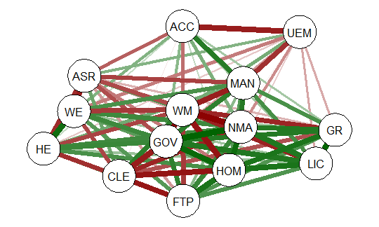
The graph displays positive correlations among variable as a green line, and
negative as a red line. The color intensity indicates the relative strength of the
correlation. While this approach provides an improvement over the raw matrix
it still rather difficult to interpret. There are many options other than those
used in the above example that allow qgraph to have a great deal of flexibility in
creating visual representation of complex relationships among variables. In the
next section I will examine one of these options that uses principal component
analysis of the data.
2.1 Using qgraph Principal Component Analysis
A discussion of the theory behind principal component exploratory analysis is
beyond the scope of this discussion. Suffice it to say that it allows for simplification
of a large number of inter-correlations by identifying factors or dimensions
that individual correlations relate to. This grouping of variables on specific factors
allows qgraph to create a visual representation of these relationships. An
excellent discussion of the theory of PCA along with R scripts can be found in
Principal Components Analysis (PCA), Steven M. Holland Department of Geology,
University of Georgia, Athens, GA, 2008.
To produce a graph using the ’detcor’ correlation matrix used above use the
following code:
#correlation matrix used is ’detcor’
#qgraph with loadings from principal components
#basic options used; many other options available
qgraph.pca(detcor, factor=3, rotation=”varimax”)
#this will yield 3 factors
This code produces the output shown below:
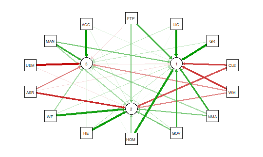
As noted above the red and green arrows indicate negative and positive loadings
on the factors, and the color intensity indicates the strength. The qgraph.pca
function produces a useful visual interpretation of the clustering of variables relative
to the three factors extracted. This would be very difficult if not impossible
with only the correlation matrix or the basic qgraph visual representation.
In a future tutorial I will explore more qgraph options that can be used to
explore the Detroit dataset as well as options for a larger datasets. In future
articles I will also explore other R packages that are also useful for analyzing
large numbers of complex variable interrelationships in very large, medium, and
small samples.
** When developing R code I strongly recommend using an IDE such as
RStudio. This is a powerful coding environment and is free for personal use as
well as being open source software. RStudio will run on a variety of platforms.
If you are developing code for future publication or sharing I would also recommend
TeXstudio, a LaTex based document development environment which is also free for personal use. This document was produced using TeXstudio 2.12.6
and RStudio 1.0.136.
An R Tutorial: Visual Representation of Complex Multivariate Relationships Using the R ‘qgraph’ Package, Part Two
An R programming tutorial by D.M. Wiig
This post is contained in a .pdf document. To access the document click on the green link shown below.
The R qgraph Package: Using R to Visualize Complex Relationships Among Variables in a Large Dataset, Part One
The R qgraph Package: Using R to Visualize Complex Relationships Among Variables in a Large Dataset, Part One
A Tutorial by D. M. Wiig, Professor of Political Science, Grand View University
In my most recent tutorials I have discussed the use of the tabplot() package to visualize multivariate mixed data types in large datasets. This type of table display is a handy way to identify possible relationships among variables, but is limited in terms of interpretation and the number of variables that can be meaningfully displayed.
Social science research projects often start out with many potential independent predictor variables for a given dependant variable. If these variables are all measured at the interval or ratio level a correlation matrix often serves as a starting point to begin analyzing relationships among variables.
In this tutorial I will use the R packages SemiPar, qgraph and Hmisc in addition to the basic packages loaded when R is started. The code is as follows:
###################################################
#data from package SemiPar; dataset milan.mort
#dataset has 3652 cases and 9 vars
##################################################
install.packages(“SemiPar”)
install.packages(“Hmisc”)
install.packages(“qgraph”)
library(SemiPar)
####################################################
One of the datasets contained in the SemiPar packages is milan.mort. This dataset contains nine variables and data from 3652 consecutive days for the city of Milan, Italy. The nine variables in the dataset are as follows:
rel.humid (relative humidity)
tot.mort (total number of deaths)
resp.mort (total number of respiratory deaths)
SO2 (measure of sulphur dioxide level in ambient air)
TSP (total suspended particles in ambient air)
day.num (number of days since 31st December, 1979)
day.of.week (1=Monday; 2=Tuesday; 3=Wednesday; 4=Thursday; 5=Friday; 6=Saturday; 7=Sunday
holiday (indicator of public holiday: 1=public holiday, 0=otherwise
mean.temp (mean daily temperature in degrees celsius)
To look at the structure of the dataset use the following
#########################################
library(SemiPar)
data(milan.mort)
str(milan.mort)
###############################################
Resulting in the output:
> str(milan.mort)
‘data.frame’: 3652 obs. of 9 variables:
$ day.num : int 1 2 3 4 5 6 7 8 9 10 …
$ day.of.week: int 2 3 4 5 6 7 1 2 3 4 …
$ holiday : int 1 0 0 0 0 0 0 0 0 0 …
$ mean.temp : num 5.6 4.1 4.6 2.9 2.2 0.7 -0.6 -0.5 0.2 1.7 …
$ rel.humid : num 30 26 29.7 32.7 71.3 80.7 82 82.7 79.3 69.3 …
$ tot.mort : num 45 32 37 33 36 45 46 38 29 39 …
$ resp.mort : int 2 5 0 1 1 6 2 4 1 4 …
$ SO2 : num 267 375 276 440 354 …
$ TSP : num 110 153 162 198 235 …
As is seen above, the dataset contains 9 variables all measured at the ratio level and 3652 cases.
In doing exploratory research a correlation matrix is often generated as a first attempt to look at inter-relationships among the variables in the dataset. In this particular case a researcher might be interested in looking at factors that are related to total mortality as well as respiratory mortality rates.
A correlation matrix can be generated using the cor function which is contained in the stats package. There are a variety of functions for various types of correlation analysis. The cor function provides a fast method to calculate Pearson’s r with a large dataset such as the one used in this example.
To generate a zero order Pearson’s correlation matrix use the following:
###############################################
#round the corr output to 2 decimal places
#put output into variable cormatround
#coerce data to matrix
#########################################
library(Hmisc)
cormatround round(cormatround, 2)
#################################################
The output is:
> cormatround > round(cormatround, 2) Day.num day.of.week holiday mean.temp rel.humid tot.mort resp.mort SO2 TSP day.num 1.00 0.00 0.01 0.02 0.12 -0.28 0.22 -0.34 0.07 day.of.week 0.00 1.00 0.00 0.00 0.00 -0.05 0.03 -0.05 -0.05 holiday 0.01 0.00 1.00 -0.07 0.01 0.00 0.01 0.00 -0.01 mean.temp 0.02 0.00 -0.07 1.00 -0.25 -0.43 -0.26 -0.66 -0.44 rel.humid 0.12 0.00 0.01 -0.25 1.00 0.01 -0.03 0.15 0.17 tot.mort -0.28 -0.05 0.00 -0.43 0.01 1.00 0.47 0.44 0.25 resp.mort -0.22 -0.03 -0.01 -0.26 -0.03 0.47 1.00 0.32 0.15 SO2 -0.34 -0.05 0.00 -0.66 0.15 0.44 0.32 1.00 0.63 TSP 0.07 -0.05 -0.01 -0.44 0.17 0.25 0.15 0.63 1.00 |
|
|
The matrix can be examined to look at intercorrelations among the nine variables, but it is very difficult to detect patterns of correlations within the matrix. Also, when using the cor() function raw Pearson’s coefficients are reported, but significance levels are not.
A correlation matrix with significance can be generated by using the rcorr() function, also found in the Hmisc package. The code is:
#############################################
library(Hmisc)
rcorr(as.matrix(milan.mort, type=”pearson”))
###################################################
The output is:
> rcorr(as.matrix(milan.mort, type="pearson")) day.num day.of.week holiday mean.temp rel.humid tot.mort resp.mort SO2 TSP day.num 1.00 0.00 0.01 0.02 0.12 -0.28 -0.22 -0.34 0.07 day.of.week 0.00 1.00 0.00 0.00 0.00 -0.05 -0.03 -0.05 -0.05 holiday 0.01 0.00 1.00 -0.07 0.01 0.00 -0.01 0.00 -0.01 mean.temp 0.02 0.00 -0.07 1.00 -0.25 -0.43 -0.26 -0.66 -0.44 rel.humid 0.12 0.00 0.01 -0.25 1.00 0.01 -0.03 0.15 0.17 tot.mort -0.28 -0.05 0.00 -0.43 0.01 1.00 0.47 0.44 0.25 resp.mort -0.22 -0.03 -0.01 -0.26 -0.03 0.47 1.00 0.32 0.15 SO2 -0.34 -0.05 0.00 -0.66 0.15 0.44 0.32 1.00 0.63 TSP 0.07 -0.05 -0.01 -0.44 0.17 0.25 0.15 0.63 1.00 n= 3652 P day.num day.of.week holiday mean.temp rel.humid tot.mort resp.mort SO2 TSP day.num 0.9771 0.5349 0.2220 0.0000 0.0000 0.0000 0.0000 day.of.week 0.9771 0.7632 0.8727 0.8670 0.0045 0.1175 0.0061 holiday 0.5349 0.7632 0.0000 0.4648 0.8506 0.6115 0.7793 0.4108 mean.temp 0.2220 0.8727 0.0000 0.0000 0.0000 0.0000 0.0000 0.0000 rel.humid 0.0000 0.8670 0.4648 0.0000 0.3661 0.1096 0.0000 0.0000 tot.mort 0.0000 0.0045 0.8506 0.0000 0.3661 0.0000 0.0000 0.0000 resp.mort 0.0000 0.1175 0.6115 0.0000 0.1096 0.0000 0.0000 0.0000 SO2 0.0000 0.0024 0.7793 0.0000 0.0000 0.0000 0.0000 0.0000 TSP 0.0000 0.0061 0.4108 0.0000 0.0000 0.0000 0.0000 0.0000 |
|
|
In a future tutorial I will discuss using significance levels and correlation strengths as methods of reducing complexity in very large correlation network structures.
The recently released package qgraph () provides a number of interesting functions that are useful in visualizing complex inter-relationships among a large number of variables. To quote from the CRAN documentation file qraph() “Can be used to visualize data networks as well as provides an interface for visualizing weighted graphical models.” (see CRAN documentation for ‘qgraph” version 1.4.2. See also http://sachaepskamp.com/qgraph).
The qgraph() function has a variety of options that can be used to produce specific types of graphical representations. In this first tutorial segment I will use the milan.mort dataset and the most basic qgraph functions to produce a visual graphic network of intercorrelations among the 9 variables in the dataset.
The code is as follows:
###################################################
library(qgraph)
#use cor function to create a correlation matrix with milan.mort dataset
#and put into cormat variable
###################################################
cormat=cor(milan.mort) #correlation matrix generated
###################################################
###################################################
#now plot a graph of the correlation matrix
###################################################
qgraph(cormat, shape=”circle”, posCol=”darkgreen”, negCol=”darkred”, layout=”groups”, vsize=10)
###################################################
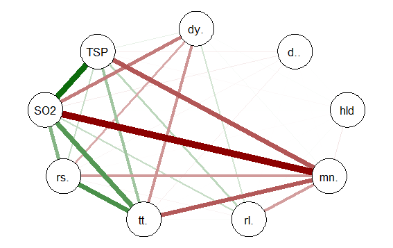
This code produces the following correlation network:

The correlation network provides a very useful visual picture of the intercorrelations as well as positive and negative correlations. The relative thickness and color density of the bands indicates strength of Pearson’s r and the color of each band indicates a positive or negative correlation – red for negative and green for positive.
By changing the “layout=” option from “groups” to “spring” a slightly different perspective can be seen. The code is:
########################################################
#Code to produce alternative correlation network:
#######################################################
library(qgraph)
#use cor function to create a correlation matrix with milan.mort dataset
#and put into cormat variable
##############################################################
cormat=cor(milan.mort) #correlation matrix generated
##############################################################
###############################################################
#now plot a circle graph of the correlation matrix
##########################################################
qgraph(cormat, shape=”circle”, posCol=”darkgreen”, negCol=”darkred”, layout=”spring”, vsize=10)
###############################################################
The graph produced is below:

Once again the intercorrelations, strength of r and positive and negative correlations can be easily identified. There are many more options, types of graph and procedures for analysis that can be accomplished with the qgraph() package. In future tutorials I will discuss some of these.
R Tutorial: Visualizing Multivariate Relationships in Large Datasets
R Tutorial: Visualizing multivariate relationships in Large Datasets
A tutorial by D.M. Wiig
In two previous blog posts I discussed some techniques for visualizing relationships involving two or three variables and a large number of cases. In this tutorial I will extend that discussion to show some techniques that can be used on large datasets and complex multivariate relationships involving three or more variables.
In this tutorial I will use the R package nmle which contains the dataset MathAchieve. Use the code below to install the package and load it into the R environment:
####################################################
#code for visual large dataset MathAchieve
#first show 3d scatterplot; then show tableplot variations
####################################################
install.packages(“nmle”) #install nmle package
library(nlme) #load the package into the R environment
####################################################
Once the package is installed take a look at the structure of the data set by using:
####################################################
attach(MathAchieve) #take a look at the structure of the dataset
str(MathAchieve)
####################################################
Classes ‘nfnGroupedData’, ‘nfGroupedData’, ‘groupedData’ and ‘data.frame’: 7185 obs. of 6 variables:
$ School : Ord.factor w/ 160 levels “8367”<“8854″<..: 59 59 59 59 59 59 59 59 59 59 …
$ Minority: Factor w/ 2 levels “No”,”Yes”: 1 1 1 1 1 1 1 1 1 1 …
$ Sex : Factor w/ 2 levels “Male”,”Female”: 2 2 1 1 1 1 2 1 2 1 …
$ SES : num -1.528 -0.588 -0.528 -0.668 -0.158 …
$ MathAch : num 5.88 19.71 20.35 8.78 17.9 …
$ MEANSES : num -0.428 -0.428 -0.428 -0.428 -0.428 -0.428 -0.428 -0.428 -0.428 -0.428 …
– attr(*, “formula”)=Class ‘formula’ language MathAch ~ SES | School
.. ..- attr(*, “.Environment”)=<environment: R_GlobalEnv>
– attr(*, “labels”)=List of 2
..$ y: chr “Mathematics Achievement score”
..$ x: chr “Socio-economic score”
– attr(*, “FUN”)=function (x)
..- attr(*, “source”)= chr “function (x) max(x, na.rm = TRUE)”
– attr(*, “order.groups”)= logi TRUE
>
As can be seen from the output shown above the MathAchieve dataset consists of 7185 observations and six variables. Three of these variables are numeric and three are factors. This presents some difficulties when visualizing the data. With over 7000 cases a two-dimensional scatterplot showing bivariate correlations among the three numeric variables is of limited utility.
We can use a 3D scatterplot and a linear regression model to more clearly visualize and examine relationships among the three numeric variables. The variable SES is a vector measuring socio-economic status, MathAch is a numeric vector measuring mathematics achievment scores, and MEANSES is a vector measuring the mean SES for the school attended by each student in the sample.
We can look at the correlation matrix of these 3 variables to get a sense of the relationships among the variables:
> ####################################################
> #do a correlation matrix with the 3 numeric vars;
> ###################################################
> data(“MathAchieve”)
> cor(as.matrix(MathAchieve[c(4,5,6)]), method=”pearson”)
SES MathAch MEANSES
SES 1.0000000 0.3607556 0.5306221
MathAch 0.3607556 1.0000000 0.3437221
MEANSES 0.5306221 0.3437221 1.0000000
>
In using the cor() function as seen above we can determine the variables used by specifying the column that each numeric variable is in as shown in the output from the str() function. The 3 numeric variables, for example, are in columns 4, 5, and 6 of the matrix.
As discussed in previous tutorials we can visualize the relationship among these three variable by using a 3D scatterplot. Use the code as seen below:
####################################################
#install.packages(“nlme”)
install.packages(“scatterplot3d”)
library(scatterplot3d)
library(nlme) #load nmle package
attach(MathAchieve) #MathAchive dataset is in environment
scatterplot3d(SES, MEANSES, MathAch, main=”Basic 3D Scatterplot”) #do the plot with default options
####################################################
The resulting plot is:
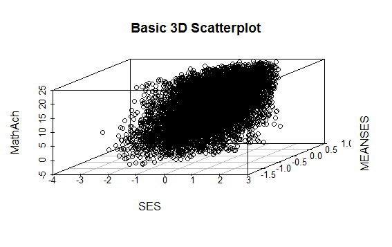
Even though the scatter plot lacks detail due to the large sample size it is still possible to see the moderate correlations shown in the correlation matrix by noting the shape and direction of the data points . A regression plane can be calculated and added to the plot using the following code:
scatterplot3d(SES, MEANSES, MathAch, main=”Basic 3D Scatterplot”) #do the plot with default options
####################################################
##use a linear regression model to plot a regression plane
#y=MathAchieve, SES, MEANSES are predictor variables
####################################################
model1=lm(MathAch ~ SES + MEANSES) ## generate a regression
#take a look at the regression output
summary(model1)
#run scatterplot again putting results in model
model <- scatterplot3d(SES, MEANSES, MathAch, main=”Basic 3D Scatterplot”) #do the plot with default options
#link the scatterplot and linear model using the plane3d function
model$plane3d(model1) ## link the 3d scatterplot in ‘model’ to the ‘plane3d’ option with ‘model1’ regression information
####################################################
The resulting output is seen below:
Call:
lm(formula = MathAch ~ SES + MEANSES)
Residuals:
Min 1Q Median 3Q Max
-20.4242 -4.6365 0.1403 4.8534 17.0496
Coefficients:
Estimate Std. Error t value Pr(>|t|)
(Intercept) 12.72590 0.07429 171.31 <2e-16 ***
SES 2.19115 0.11244 19.49 <2e-16 ***
MEANSES 3.52571 0.21190 16.64 <2e-16 ***
—
Signif. codes: 0 ‘***’ 0.001 ‘**’ 0.01 ‘*’ 0.05 ‘.’ 0.1 ‘ ’ 1
Residual standard error: 6.296 on 7182 degrees of freedom
Multiple R-squared: 0.1624, Adjusted R-squared: 0.1622
F-statistic: 696.4 on 2 and 7182 DF, p-value: < 2.2e-16
and the plot with the plane is:

While the above analysis gives us useful information, it is limited by the mixture of numeric values and factors. A more detailed visual analysis that will allow the display and comparison of all six of the variables is possible by using the functions available in the R package Tableplots. This package was created to aid in the visualization and inspection of large datasets with multiple variables.
The MathAchieve contains a total of six variables and 7185 cases. The Tableplots package can be used with datasets larger than 10,000 observations and up to 12 or so variables. It can be used visualize relationships among variables using the same measurement scale or mixed measurement types.
To look at a comparisons of each data type and then view all 6 together begin with the following:
####################################################
attach(MathAchieve) #attach the dataset
#set up 3 data frames with numeric, factors, and mixed
####################################################
mathmix <- data.frame(SES,MathAch,MEANSES,School=factor(School),Minority=factor(Minority),Sex=factor(Sex)) #all 6 vars
mathfact <- data.frame(School=factor(School),Minority=factor(Minority),Sex=factor(Sex)) #3 factor vars
mathnum <- data.frame(SES,MathAch,MEANSES) #3 numeric vars
####################################################
To view a comparison of the 3 numeric variables use:
####################################################
require(tabplot) #load tabplot package
tableplot(mathnum) #generate a table plot with numeric vars only
####################################################
resulting in the following output:

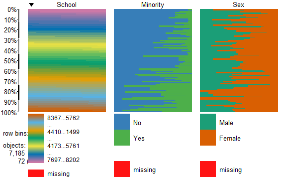
To view only the 3 factor variables use:
####################################################
require(tabplot) #load tabplot package
tableplot(mathfact) #generate a table plot with factors only
####################################################
Resulting in:
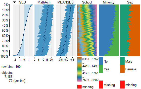
To view and compare table plots of all six variables use:
####################################################
require(tabplot) #load tabplot package
tableplot(mathmix) #generate a table plot with all six variables
####################################################
Resulting in:

Using tableplots is useful in visualizing relationships among a set of variabes. The fact that comparisons can be made using mixed levels of measurement and very large sample sizes provides a tool that the researcher can use for initial exploratory data analysis.
The above visual table comparisons agree with the moderate correlation among the three numeric variables found in the correlation and regression models discussed above. It is also possible to add some additional interpretation by viewing and comparing the mix of both factor and numeric variables.
In this tutorial I have provided a very basic introduction to the use of table plots in visualizing data. Interested readers can find an abundance of information about Tableplot options and interpretations in the CRAN documentation.
In my next tutorial I will continue a discussion of methods to visualize large and complex datasets by looking at some techniques that allow exploration of very large datasets and up to 12 variables or more.
R For Beginners: Basic Graphics Code to Produce Informative Graphs, Part Two, Working With Big Data
R for beginners: Some basic graphics code to produce informative graphs, part two, working with big data
A tutorial by D. M. Wiig
In part one of this tutorial I discussed the use of R code to produce 3d scatterplots. This is a useful way to produce visual results of multi- variate linear regression models. While visual displays using scatterplots is a useful tool when using most datasets it becomes much more of a challenge when analyzing big data. These types of databases can contain tens of thousands or even millions of cases and hundreds of variables.
Working with these types of data sets involves a number of challenges. If a researcher is interested in using visual presentations such as scatterplots this can be a daunting task. I will start by discussing how scatterplots can be used to provide meaningful visual representation of the relationship between two variables in a simple bivariate model.
To start I will construct a theoretical data set that consists of ten thousand x and y pairs of observations. One method that can be used to accomplish this is to use the R rnorm() function to generate a set of random integers with a specified mean and standard deviation. I will use this function to generate both the x and y variable.
Before starting this tutorial make sure that R is running and that the datasets, LSD, and stats packages have been installed. Use the following code to generate the x and y values such that the mean of x= 10 with a standard deviation of 7, and the mean of y=7 with a standard deviation of 3:
##############################################
## make sure package LSD is loaded
##
library(LSD)
x <- rnorm(50000, mean=10, sd=15) # # generates x values #stores results in variable x
y <- rnorm(50000, mean=7, sd=3) ## generates y values #stores results in variable y
####################################################
Now the scatterplot can be created using the code:
##############################################
## plot randomly generated x and y values
##
plot(x,y, main=”Scatterplot of 50,000 points”)
####################################################
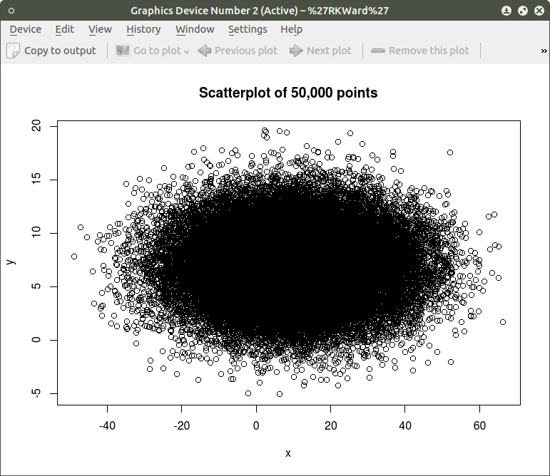
As can be seen the resulting plot is mostly a mass of black with relatively few individual x and y points shown other than the outliers. We can do a quick histogram on the x values and the y values to check the normality of the resulting distribution. This shown in the code below:
####################################################
## show histogram of x and y distribution
####################################################
hist(x) ## histogram for x mean=10; sd=15; n=50,000
##
hist(y) ## histogram for y mean=7; sd=3; n-50,000
####################################################
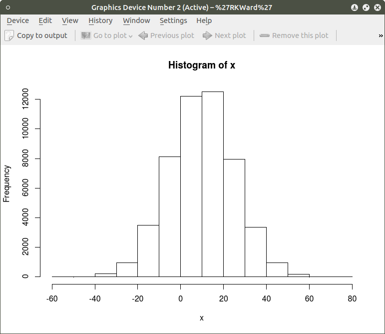
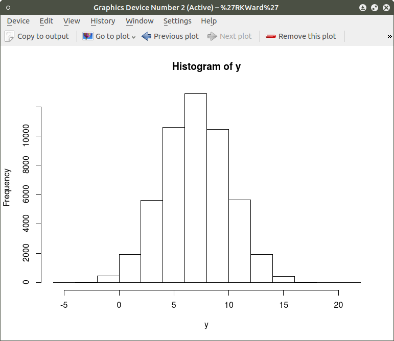
The histogram shows a normal distribution for both variables. As is expected, in the x vs. y scatterplot the center mass of points is located at the x = 10; y=7 coordinate of the graph as this coordinate contains the mean of each distribution. A more meaningful scatterplot of the dataset can be generated using a the R functions smoothScatter() and heatscatter(). The smoothScatter() function is located in the graphics package and the heatscatter() function is located in the LSD package.
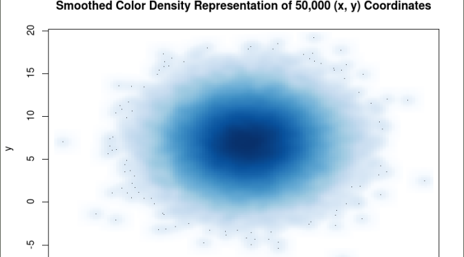
The smoothScatter() function creates a smoothed color density representation of a scatterplot. This allows for a better visual representation of the density of individual values for the x and y pairs. To use the smoothScatter() function with the large dataset created above use the following code:
##############################################
## use smoothScatter function to visualize the scatterplot of #50,000 x ## and y values
## the x and y values should still be in the workspace as #created above with the rnorm() function
##
smoothScatter(x, y, main = “Smoothed Color Density Representation of 50,000 (x,y) Coordinates”)
##
####################################################

The resulting plot shows several bands of density surrounding the coordinates x=10, y=7 which are the means of the two distributions rather than an indistinguishable mass of dark points.
Similar results can be obtained using the heatscatter() function. This function produces a similar visual based on densities that are represented as color bands. As indicated above, the LSD package should be installed and loaded to access the heatscatter() function. The resulting code is:
##############################################
## produce a heatscatter plot of x and y
##
library(LSD)
heatscatter(x,y, main=”Heat Color Density Representation of 50,000 (x, y) Coordinates”) ## function heatscatter() with #n=50,000
####################################################
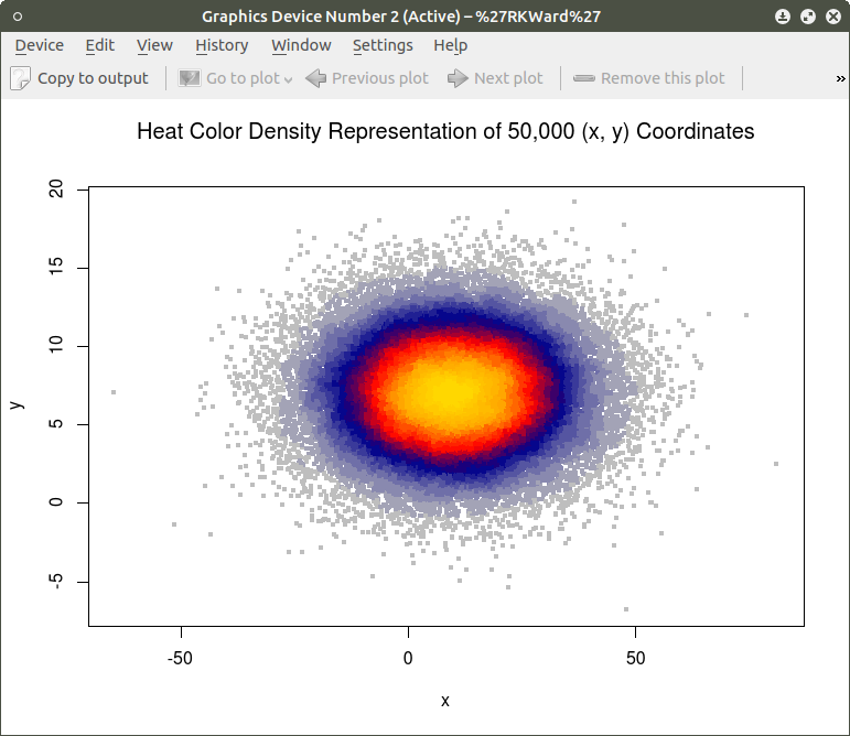
In comparing this plot with the smoothScatter() plot one can more clearly see the distinctive density bands surrounding the coordinates x=10, y=7. You may also notice depending on the computer you are using that there is a noticeably longer processing time required to produce the heatscatter() plot.
This tutorial has hopefully provided some useful information relative to visual displays of large data sets. In the next segment I will discuss how these techniques can be used on a live database containing millions of cases.
R for Beginners: Some Simple Code to Produce Informative Graphs, Part One
A Tutorial by D. M. Wiig
The R programming language has a multitude of packages that can be used to display various types of graph. For a new user looking to display data in a meaningful way graphing functions can look very intimidating. When using a statistics package such as SPSS, Stata, Minitab or even some of the R Gui’s such R Commander sophisticated graphs can be produced but with a limited range of options. When using the R command line to produce graphics output the user has virtually 100 percent control over every aspect of the graphics output.
For new R users there are some basic commands that can be used that are easy to understand and offer a large degree of control over customisation of the graphical output. In part one of this tutorial I will discuss some R scripts that can be used to show typical output from a basic correlation and regression analysis.
For the first example I will use one of the datasets from the R MASS dataset package. The dataset is ‘UScrime´ which contains data on certain factors and their relationship to violent crime. In the first example I will produce a simple scatter plot using the variables ‘GDP’ as the independent variable and ´crimerate´ the dependent variable which is represented by the letter ‘y’ in the dataset.
Before starting on this project install and load the R package ‘MASS.’ Other needed packages are loaded when R is started. The scatter plot is produced using the following code:
####################################################
### make sure that the MASS package is installed
###################################################
library(MASS) ## load MASS
attach(UScrime) ## use the UScrime dataset
## plot the two dimensional scatterplot and add appropriate #labels
#
plot(GDP, y,
main=”Basic Scatterplot of Crime Rate vs. GDP”,
xlab=”GDP”,
ylab=”Crime Rate”)
#
####################################################
The above code produces a two-dimensional plot of GDP vs. Crimerate. A regression line can be added to the graph produced by including the following code:
####################################################
## add a regression line to the scatter plot by using simple bivariate #linear model
## lm generates the coefficients for the regression model.extract
## col sets color; lwd sets line width; lty sets line type
#
abline(lm(y ~ GDP), col=”red”, lwd=2, lty=1)
#
####################################################
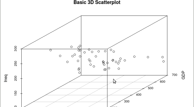
As is often the case in behavioral research we want to evaluate models that involve more than two variables. For multivariate models scatter plots can be generated using a 3 dimensional version of the R plot() function. For the above model we can add a third variable ‘Ineq’ from the dataset which is a measure the distribution of wealth in the population. Since we are now working with a multivariate linear model of the form ‘y = b1(x1) + b2(x2) + a’ we can use the R function scatterplot3d() to generate a 3 dimensional representation of the variables.
Once again we use the MASS package and the dataset ‘UScrime’ for the graph data. The code is seen below:
####################################################
## create a 3d graph using the variables y, GDP, and Ineq
####################################################
#
library(scatterplot3d) ##load scatterplot3d function
require(MASS)
attach(UScrime) ## use data from UScrime dataset
scatterplot3d(y,GDP, Ineq,
main=”Basic 3D Scatterplot”) ## graph 3 variables, y
#
###################################################
The following graph is produced:

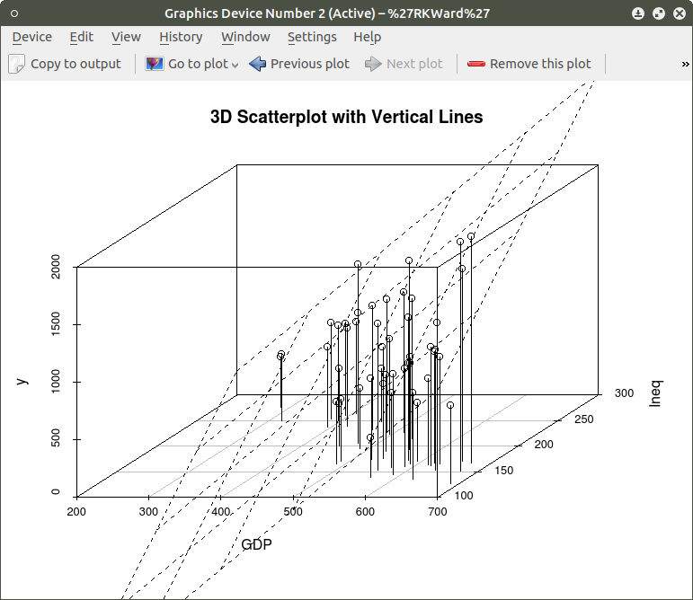
The above code will generate a basic 3d plot using default values. We can add straight lines from the plane of the graph to each of the data points by setting the graph type option as ‘type=”h”, as seen in the code below:
##############################################
require(MASS)
library(scatterplot3d)
attach(UScrime)
model <- scatterplot3d(GDP, Ineq, y,
type=”h”, ## add vertical lines from plane with this option
main=”3D Scatterplot with Vertical Lines”)
####################################################
This results in the graph:

There are numerous options that can be used to go beyond the basic 3d plot. Refer to CRAN documentation to see these. A final addition to the 3d plot as discussed here is the code needed to generate the regression plane of our linear regression model using the y (crimerate), GDP, and Ineq variables. This is accomplished using the plane3d() option that will draw a plane through the data points of the existing plot. The code to do this is shown below:
##############################################
require(MASS)
library(scatterplot3d)
attach(UScrime)
model <- scatterplot3d(GDP, Ineq, y,
type=”h”, ## add vertical line from plane to data points with this #option
main=”3D Scatterplot with Vertical Lines”)
## now calculate and add the linear regression data
model1 <- lm(y ~ GDP + Ineq) #
model$plane3d(model1) ## link the 3d scatterplot in ‘model’ to the ‘plane3d’ option with ‘model1’ regression information
#
####################################################
The resulting graph is:
To draw a regression plane through the data points only change the ‘type’ option to ‘type=”p” to show the data points without vertical lines to the plane. There are also many other options that can be used. See the CRAN documentation to review them.
I have hopefully shown that relatively simple R code can be used to generate some informative and useful graphs. Once you start to become aware of how to use the multitude of options for these functions you can have virtually total control of the visual presentation of data. I will discuss some additional simple graphs in the next tutorial that I post.
R For Beginners: Some Simple R Code to do Common Statistical Procedures, Part Two
An R tutorial by D. M. Wiig
This posting contains an embedded Word document. To view the document full screen click on the icon in the lower right hand corner of the embedded document.
R For Beginners: Basic R Code for Common Statistical Procedures Part I
An R tutorial by D. M. Wiig
This section gives examples of code to perform some of the most common elementary statistical procedures. All code segments assume that the package ‘car’ has been loaded and the file ‘Freedman’ has been loaded as the active dataset. Use the menu from the R console to load the ’car’ dataset or use the following command line to access the CRAN site list and packages:
install.packages()
Once the ’car’ package has been downloaded and installed use the following command to make it the active library.
require(car)
Load the ‘Freedman’ data file from the dataset ‘car’
data(Freedman, package="car")
List basic descriptives of the variables:
summary(Freedman)
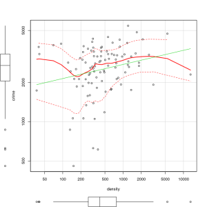
Perform a correlation between two variables using Pearson, Kendall or Spearman’s correlation:
cor(filename[,c("var1","var2")], use="complete.obs", method="pearson")
cor(filename[,c("var1","var2")], use="complete.obs", method="spearman")
cor(filename[,c("var1","var2")], use="complete.obs", method="kendall")
Example:
cor(Freedman[,c("crime","density")], use="complete.obs", method="pearson")
cor(Freedman[,c("crime","density")], use="complete.obs", method="kendall")
cor(Freedman[,c("crime","density")], use="complete.obs", method="spearman")
In the next post I will discuss basic code to produce multiple correlations and linear regression analysis. See other tutorials on this blog for more R code examples for basic statistical analysis.
R Video Tutorial: Basic R Code to Load a Data File and Produce a Histogram
R For Beginners: Some Simple R Code to Load a Data File and Produce a Histogram
A tutorial by D. M. Wiig
I have found that a good method for learning how to write R code is to examine complete code segments written to perform specific tasks and to modify these procedures to fit your specific needs. Trying to master R code in the abstract by reading a book or manual can be informative but is more often confusing. Observing what various code segments do by observing the results allows you to learn with hands-on additions and modifications as needed for your purposes.
In this document I have included a short video tutorial that discusses loading a dataset from the R library, examining the contents of the dataset and selecting one of the variables to examine using a basic histogram. I have included an annotated code chunk of the procedures discussed in the video.
The video appears below with the code segment following.
Here is the annotated code used in the video:
###################################
#use the dataset mtcars from the ‘datasets’ package
#select the variable mpg to do a histogram
#show a frequency distribution of the scores
##########################################
#library is ‘datasets’
#########################################
library(“datasets”)
#########################################
#take a look at what is in ‘datasets’
#########################################
library(help=”datasets”)
#######################################
#take a look at the ‘mtcars’ data
#########################################
View(mtcars)
#######################################
#now do a basic histogram with the hist function
###########################################
hist(mtcars$mpg)
#############################################
#dress up the graph; not covered in the video but easy to do
############################################
hist(mtcars$mpg, col=”red”, xlab = “Miles per Gallon”, main = “Basic Histogram Using ‘mtcars’ Data”)
###################################################
