An R programming tutorial by D.M. Wiig
This post is contained in a .pdf document. To access the document click on the green link shown below.
An R programming tutorial by D.M. Wiig
This post is contained in a .pdf document. To access the document click on the green link shown below.
R Tutorial: Visualizing multivariate relationships in Large Datasets
A tutorial by D.M. Wiig
In two previous blog posts I discussed some techniques for visualizing relationships involving two or three variables and a large number of cases. In this tutorial I will extend that discussion to show some techniques that can be used on large datasets and complex multivariate relationships involving three or more variables.
In this tutorial I will use the R package nmle which contains the dataset MathAchieve. Use the code below to install the package and load it into the R environment:
####################################################
#code for visual large dataset MathAchieve
#first show 3d scatterplot; then show tableplot variations
####################################################
install.packages(“nmle”) #install nmle package
library(nlme) #load the package into the R environment
####################################################
Once the package is installed take a look at the structure of the data set by using:
####################################################
attach(MathAchieve) #take a look at the structure of the dataset
str(MathAchieve)
####################################################
Classes ‘nfnGroupedData’, ‘nfGroupedData’, ‘groupedData’ and ‘data.frame’: 7185 obs. of 6 variables:
$ School : Ord.factor w/ 160 levels “8367”<“8854″<..: 59 59 59 59 59 59 59 59 59 59 …
$ Minority: Factor w/ 2 levels “No”,”Yes”: 1 1 1 1 1 1 1 1 1 1 …
$ Sex : Factor w/ 2 levels “Male”,”Female”: 2 2 1 1 1 1 2 1 2 1 …
$ SES : num -1.528 -0.588 -0.528 -0.668 -0.158 …
$ MathAch : num 5.88 19.71 20.35 8.78 17.9 …
$ MEANSES : num -0.428 -0.428 -0.428 -0.428 -0.428 -0.428 -0.428 -0.428 -0.428 -0.428 …
– attr(*, “formula”)=Class ‘formula’ language MathAch ~ SES | School
.. ..- attr(*, “.Environment”)=<environment: R_GlobalEnv>
– attr(*, “labels”)=List of 2
..$ y: chr “Mathematics Achievement score”
..$ x: chr “Socio-economic score”
– attr(*, “FUN”)=function (x)
..- attr(*, “source”)= chr “function (x) max(x, na.rm = TRUE)”
– attr(*, “order.groups”)= logi TRUE
>
As can be seen from the output shown above the MathAchieve dataset consists of 7185 observations and six variables. Three of these variables are numeric and three are factors. This presents some difficulties when visualizing the data. With over 7000 cases a two-dimensional scatterplot showing bivariate correlations among the three numeric variables is of limited utility.
We can use a 3D scatterplot and a linear regression model to more clearly visualize and examine relationships among the three numeric variables. The variable SES is a vector measuring socio-economic status, MathAch is a numeric vector measuring mathematics achievment scores, and MEANSES is a vector measuring the mean SES for the school attended by each student in the sample.
We can look at the correlation matrix of these 3 variables to get a sense of the relationships among the variables:
> ####################################################
> #do a correlation matrix with the 3 numeric vars;
> ###################################################
> data(“MathAchieve”)
> cor(as.matrix(MathAchieve[c(4,5,6)]), method=”pearson”)
SES MathAch MEANSES
SES 1.0000000 0.3607556 0.5306221
MathAch 0.3607556 1.0000000 0.3437221
MEANSES 0.5306221 0.3437221 1.0000000
>
In using the cor() function as seen above we can determine the variables used by specifying the column that each numeric variable is in as shown in the output from the str() function. The 3 numeric variables, for example, are in columns 4, 5, and 6 of the matrix.
As discussed in previous tutorials we can visualize the relationship among these three variable by using a 3D scatterplot. Use the code as seen below:
####################################################
#install.packages(“nlme”)
install.packages(“scatterplot3d”)
library(scatterplot3d)
library(nlme) #load nmle package
attach(MathAchieve) #MathAchive dataset is in environment
scatterplot3d(SES, MEANSES, MathAch, main=”Basic 3D Scatterplot”) #do the plot with default options
####################################################
The resulting plot is:
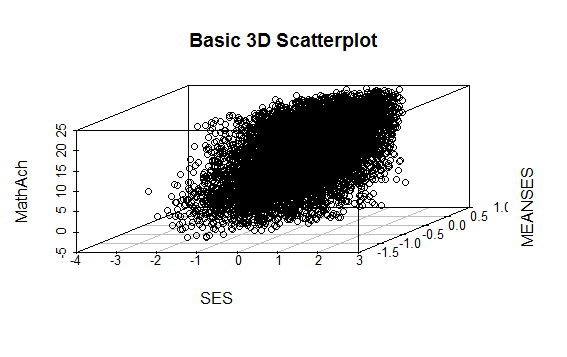
Even though the scatter plot lacks detail due to the large sample size it is still possible to see the moderate correlations shown in the correlation matrix by noting the shape and direction of the data points . A regression plane can be calculated and added to the plot using the following code:
scatterplot3d(SES, MEANSES, MathAch, main=”Basic 3D Scatterplot”) #do the plot with default options
####################################################
##use a linear regression model to plot a regression plane
#y=MathAchieve, SES, MEANSES are predictor variables
####################################################
model1=lm(MathAch ~ SES + MEANSES) ## generate a regression
#take a look at the regression output
summary(model1)
#run scatterplot again putting results in model
model <- scatterplot3d(SES, MEANSES, MathAch, main=”Basic 3D Scatterplot”) #do the plot with default options
#link the scatterplot and linear model using the plane3d function
model$plane3d(model1) ## link the 3d scatterplot in ‘model’ to the ‘plane3d’ option with ‘model1’ regression information
####################################################
The resulting output is seen below:
Call:
lm(formula = MathAch ~ SES + MEANSES)
Residuals:
Min 1Q Median 3Q Max
-20.4242 -4.6365 0.1403 4.8534 17.0496
Coefficients:
Estimate Std. Error t value Pr(>|t|)
(Intercept) 12.72590 0.07429 171.31 <2e-16 ***
SES 2.19115 0.11244 19.49 <2e-16 ***
MEANSES 3.52571 0.21190 16.64 <2e-16 ***
—
Signif. codes: 0 ‘***’ 0.001 ‘**’ 0.01 ‘*’ 0.05 ‘.’ 0.1 ‘ ’ 1
Residual standard error: 6.296 on 7182 degrees of freedom
Multiple R-squared: 0.1624, Adjusted R-squared: 0.1622
F-statistic: 696.4 on 2 and 7182 DF, p-value: < 2.2e-16
and the plot with the plane is:

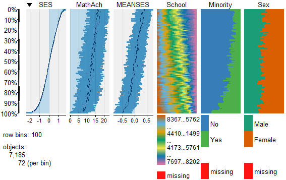
While the above analysis gives us useful information, it is limited by the mixture of numeric values and factors. A more detailed visual analysis that will allow the display and comparison of all six of the variables is possible by using the functions available in the R package Tableplots. This package was created to aid in the visualization and inspection of large datasets with multiple variables.
The MathAchieve contains a total of six variables and 7185 cases. The Tableplots package can be used with datasets larger than 10,000 observations and up to 12 or so variables. It can be used visualize relationships among variables using the same measurement scale or mixed measurement types.
To look at a comparisons of each data type and then view all 6 together begin with the following:
####################################################
attach(MathAchieve) #attach the dataset
#set up 3 data frames with numeric, factors, and mixed
####################################################
mathmix <- data.frame(SES,MathAch,MEANSES,School=factor(School),Minority=factor(Minority),Sex=factor(Sex)) #all 6 vars
mathfact <- data.frame(School=factor(School),Minority=factor(Minority),Sex=factor(Sex)) #3 factor vars
mathnum <- data.frame(SES,MathAch,MEANSES) #3 numeric vars
####################################################
To view a comparison of the 3 numeric variables use:
####################################################
require(tabplot) #load tabplot package
tableplot(mathnum) #generate a table plot with numeric vars only
####################################################
resulting in the following output:

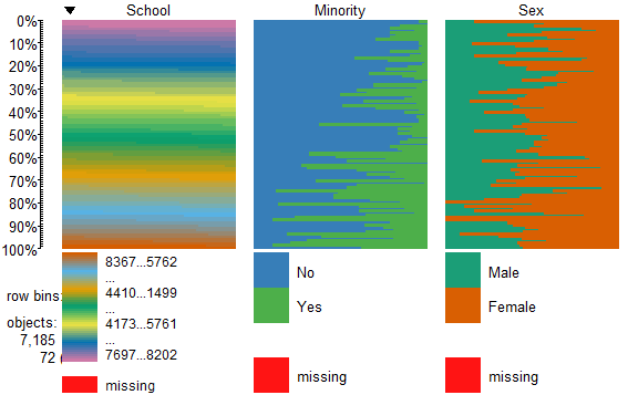
To view only the 3 factor variables use:
####################################################
require(tabplot) #load tabplot package
tableplot(mathfact) #generate a table plot with factors only
####################################################
Resulting in:
To view and compare table plots of all six variables use:
####################################################
require(tabplot) #load tabplot package
tableplot(mathmix) #generate a table plot with all six variables
####################################################
Resulting in:

Using tableplots is useful in visualizing relationships among a set of variabes. The fact that comparisons can be made using mixed levels of measurement and very large sample sizes provides a tool that the researcher can use for initial exploratory data analysis.
The above visual table comparisons agree with the moderate correlation among the three numeric variables found in the correlation and regression models discussed above. It is also possible to add some additional interpretation by viewing and comparing the mix of both factor and numeric variables.
In this tutorial I have provided a very basic introduction to the use of table plots in visualizing data. Interested readers can find an abundance of information about Tableplot options and interpretations in the CRAN documentation.
In my next tutorial I will continue a discussion of methods to visualize large and complex datasets by looking at some techniques that allow exploration of very large datasets and up to 12 variables or more.
An R tutorial by D. M. Wiig
This posting contains an embedded Word document. To view the document full screen click on the icon in the lower right hand corner of the embedded document.
An R tutorial by D. M. Wiig
This section gives examples of code to perform some of the most common elementary statistical procedures. All code segments assume that the package ‘car’ has been loaded and the file ‘Freedman’ has been loaded as the active dataset. Use the menu from the R console to load the ’car’ dataset or use the following command line to access the CRAN site list and packages:
install.packages()
Once the ’car’ package has been downloaded and installed use the following command to make it the active library.
require(car)
Load the ‘Freedman’ data file from the dataset ‘car’
data(Freedman, package="car")
List basic descriptives of the variables:
summary(Freedman)
Perform a correlation between two variables using Pearson, Kendall or Spearman’s correlation:
cor(filename[,c("var1","var2")], use="complete.obs", method="pearson")
cor(filename[,c("var1","var2")], use="complete.obs", method="spearman")
cor(filename[,c("var1","var2")], use="complete.obs", method="kendall")
Example:
cor(Freedman[,c("crime","density")], use="complete.obs", method="pearson")
cor(Freedman[,c("crime","density")], use="complete.obs", method="kendall")
cor(Freedman[,c("crime","density")], use="complete.obs", method="spearman")
In the next post I will discuss basic code to produce multiple correlations and linear regression analysis. See other tutorials on this blog for more R code examples for basic statistical analysis.
R For Beginners: Some Simple R Code to Load a Data File and Produce a Histogram
A tutorial by D. M. Wiig
I have found that a good method for learning how to write R code is to examine complete code segments written to perform specific tasks and to modify these procedures to fit your specific needs. Trying to master R code in the abstract by reading a book or manual can be informative but is more often confusing. Observing what various code segments do by observing the results allows you to learn with hands-on additions and modifications as needed for your purposes.
In this document I have included a short video tutorial that discusses loading a dataset from the R library, examining the contents of the dataset and selecting one of the variables to examine using a basic histogram. I have included an annotated code chunk of the procedures discussed in the video.
The video appears below with the code segment following.
Here is the annotated code used in the video:
R For Beginners: A Video Tutorial on Installing and Using the Deducer Statistics Package with the R Console
In previous tutorials I have discussed the use of R Commander and Deducer statistical packages that provide a menu based GUI for R. In this video tutorial I will discuss downloading and installing the Deducer statistics package. This video is designed to support my previous tutorial on the same subject.
I have embedded the video below, I hope you find this tutorial a useful adjunct to installing and using the menu based Deducer package.
This document is an embedded Word document. To view it full screen click on the icon in the lower right corner of the screen
A Tutorial by D. M. Wiig
This is an embedded Word document. To view it full screen click on the icon in the lower right cornet of the document.
Watch for more tutorials discussing R statistics on a Linux platform.
R Video Tutorial For Beginners: Installing And Using the Rcommander GUI
A tutorial video by D. M. Wiig
In my recent series of tutorials for those interested in the R statistical programming language I have discussed both the installation and use of the R console and R Commander statistics GUI. Before viewing the tutorial make sure the R Commander package has been download into your R library via the Install Packages menu option. This procedure was discussed in the previously posted R Commander tutorial.
Relative to this first tutorial I have have created a video that covers the initial installation of R Commander. The video is seen below:
Click the icon in the lower right side of the screen to view the tutorial in full screen mode.
I hope that you find this useful in your pursuit of learning about R statistics.
R for beginners: Using R Commander in introductory statistics courses
A tutorial by D. M. Wiig
As with previous tutorials in this series this document is an embedded Word documents. To view the document full screen click on the icon in the lower right corner of the window.
A tutorial by Douglas M. Wiig
Please note that this post is an embedded Word document. To read the document full screen click on the icon in the lower right portion of the document window.