Tag Archives: using r for statistics

Visual Representation of Complex Data Using R: The tm and wordcloud Packages: Part One Revisited and Updated


I am uploading this “revision of the Revisited and updated” post in a plain text format to better facilliate the use of RSS feed readers to access the article. Links to the PDF version of this posting and the SOTU text file are at the bottom of the my previous post.

After a hiatus during which I retired from a teaching career I am returning to a project that I started nearly five years ago. I have published on this site many tutorials using R analysis to examine large data sets with many variables. My last post on this was part one of a project that involves large data sets composed of text data such as speeches. Virtually any collection of text can be processed using R and numerous R packages have been developed to generate various types of statistical analysis such word frequency counts and correlations among word frequencies. These statistics help enhance the information that is presented visually in the wordcloud graphic generated by the packages discussed in the Part One tutorial.

In this updated version of the Part One tutorial I will review the use of these tools using updated R packages and an analysis using text of the 2026 State of the Union Address. As indicated in Part One, full texts of State of the Union Addresses are available in several formats that can be downloaded. These cover Presidents from George W. Bush to the current term of Donald Trump, and can be found at https://www.govinfo.gov/features/state-of-the-union

There are other sources for SOTU texts but the government website allows quick selection of a file and one click to download the file. I simply save the selected file into a Windows Notepad text file. Make sure when you view the downloaded file that it is in an 80 column format and not formatted to fit a small screen such as a cellphone or tablet. I have found at least a couple of these files that are in the latter format and are not read correctly by the R functions presented in this paper.

The 2026 address was formatted originally in a small screen format. I found a wide-column transcript that I have used in this analysis. A link to the file is found on this website at the end of the article.

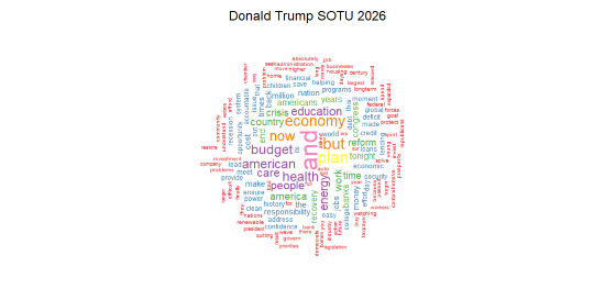
This section contains the updated R code that was presented in part one of this project. As indicated above, the resulting wordcloud is from the 2026 State of the Union. Additional code is presented in this section to calculate and print a word frequency table and to print a matrix of word association coefficients for the most used words.

Before diving into the code make sure that you have installed the latest version of the R console or an IDE such as RStudio. As I have stated earlier, I highly recommend the use of RStudio as a development environment and all of the projects presented on this website were coded and refined on this platform. As is the case with any IDE there is a learning curve, but if you are more than a casual programmer the learning process is well worth the effort. If you are using the R console and want to make sure all packages are up to date you can use the following code
#################################################################################script to access and install the newest version of the R console
###############################################################################
#the console should be updated from the Windows R console not from RStudio
#use the following code from the console
################################################################################
install.packages(“installr”) #download installer
library(installr) #move installer to library
updateR() #run the update; follow prompts as needed
################################################################################

The updated wordcloud code as shown below has been extensively commented as to the purpose of the sections within the program structure. For the sake of brevity I will not repeat the explanations contained in the original posting of this document. You can refer to that document on this website if necessary. I should also point out that you can copy all or parts of the code as presented here and paste it into the R console or RStudio code section. It should run properly. I tried to present the code in sections delimited by comments that allow segments to run individually for debugging purposes. As noted in the comments, make sure you change the table function argument section to point to the location of your downloaded text file. The complete code is seen below.


#NOTE:THIS SECTION HAS BEEN UPDATED WITH TRUMP SOTU 2026 DATA
#this is an updated version of Wordcloud1 that will include
#analysis and graphic representation of word counts and association coefficients
#for a single SOTU, Trump 2026
####################################################
#Load required packages
#####################################################
install.packages(“tm”) #processes data
install.packages(“wordcloud”) #creates visual plot
install.packages(“tidyverse”) #graphics utilities
install.packages(“readr”) #to load text files
install.packages(“RColorBrewer”) #for color graphics
#####################################################
#####################################################
#Load and view raw 2026 SOTU text file ‘sotu26.txt’
#Use RStudio Import Dataset tab or code below
#NOTE: BE SURE TO CHANGE THE read_table ARGUMENT TO
#POINT TO THE LOCATION OF THE FILE YOU ARE USING
#####################################################
library(readr)
statu26 <- read_table(“e:/dellfiles/sotu26.txt”, col_names = FALSE) #make sure this points to your file location!
#View(statu26)
####################################################
#Take raw text file statu26 and convert to corpus format named docs26
#####################################################
library(tm)
docs26 <- Corpus(VectorSource(statu26))
####################################################
#Clean punctuation, stopwords, white space
#Three passes create corpus vector source from original file
#A corpus is a collection of text
#One of the functions removes ‘stopwords’, words that are pre-defined
####################################################
library(tm)
library(wordcloud)
data(docs26)
docs26 <- tm_map(docs26, function(x)removeWords(x,stopwords()))
docs26 <- tm_map(docs26,removePunctuation) #remove punctuation
################################################################
#remove stopwords using with ‘en’ or ‘SMART’ criteria
docs26 <- tm_map(docs26,removeWords,stopwords(“SMART”))
###############################################################
docs26 <- tm_map(docs26,stripWhitespace) #remove white space
####################################################
#Cleaned corpus is now formatted into text document matrix
#Then frequency count done for each word in matrix
#dmat <-create matrix; dval <-sort; dframe <-count word frequencies
###################################################
docmat <- TermDocumentMatrix(docs26)
dmat <- as.matrix(docmat)
dval <- sort(rowSums(dmat),decreasing=TRUE)
dframe <- data.frame(word=names(dval),freq=dval)
####################################################
#Final step is to use wordcloud to generate graphics
#There are a number of options that can be set
#Use RColorBrewer to generate a color wordcloud
####################################################
library(RColorBrewer)
set.seed(1234) #use if random.color=TRUE
par(bg=”white”) #background color
wordcloud(dframe$word,dframe$freq,colors=brewer.pal(8,”Set1″),random.order=FALSE,scale=c(2.75,0.35),min.freq=2,max.words=150,rot.per=0.35)
###################################################
####################################################
# Add a title above the plot
mtext(“Donald Trump SOTU 2026”, side = 3, line = 2, cex = 1.5)
##############################################################################
#this section contains code for printing word freq tables;
#word assoc analysis
#########################################################
#code to print 15 most used words with freq
####################################################
#for 2026 address
head(dframe,15)
######################################################
#code to find associations among specified terms
#drops assoc < .25
#initial setup formost frequent words; used between 10 and 25 times
#####################################################
#for 2026 address
findAssocs(docmat,terms = c(“and”,”but”,”budget”,”know”,”economy”,”health”,”plan”,”american”,”energy”,”people”,”care”),corlimit = .25)
######################################################


The output from the code will produce the wordcloud graphic display, a list of the most frequently used words in the document, and a matrix that displays association strengths equal to or greater than .25 for eleven of the most frequently used words in the document. A specific analysis of word frequencies and associations will be the topic of a future paper.

Shown below is the wordcloud graphic, the table of most frequently used words, and a portion of the association matrix generated by the code. I have only shown the portion of the matrix using the four most frequently used words.


Word Frequencies

word freq
and and 25
plan plan 16
but but 15
economy economy 14
now now 13
budget budget 12
health health 12
american american 12
education education 11
energy energy 11
people people 10
care care 10
country country 9
work work 9
america america 9


The association matrix:

$and
along already cmadam first now over second
0.85 0.85 0.85 0.85 0.85 0.85 0.85
speaking still thanks these third the this
0.85 0.85 0.85 0.85 0.85 0.79 0.73
for finally because there you its meet
0.71 0.64 0.50 0.44 0.44 0.41 0.29
bay career claims classroom commerce conscience earned
0.29 0.29 0.29 0.29 0.29 0.29 0.29
fallen ignore import industries ineffective layoffs marketbased
0.29 0.29 0.29 0.29 0.29 0.29 0.29
member message pad perseveres piles pride retooled
0.29 0.29 0.29 0.29 0.29 0.29 0.29
sacrifice succeed warera wealthy
0.29 0.29 0.29 0.29

$but
along already cmadam first over second
0.83 0.83 0.83 0.83 0.83 0.83
speaking still thanks these third now
0.83 0.83 0.83 0.83 0.83 0.81
the this for there finally because
0.81 0.65 0.64 0.64 0.53 0.43
you its agribusiness anger breaks cities
0.43 0.35 0.30 0.30 0.30 0.30
compete csomewhere lower messes pakistan percent
0.30 0.30 0.30 0.30 0.30 0.30
presidents pushed readying reality rebuilt set
0.30 0.30 0.30 0.30 0.30 0.30
transformation view
0.30 0.30

$plan
bank stand held full lose president
0.44 0.42 0.42 0.42 0.42 0.42
weakened builds challenge cmr intend preserve
0.42 0.41 0.41 0.41 0.41 0.41
progress proud respond tells creating cvice
0.41 0.41 0.41 0.41 0.41 0.41
deeds flow friends greensburg honest illusions
0.41 0.41 0.41 0.41 0.41 0.41
ive leonard outstanding prescription speak stopped
0.41 0.41 0.41 0.41 0.41 0.41
strain transform tysheoma boldly candidly doors
0.41 0.41 0.41 0.41 0.41 0.41
join men opinions recognizes showing stability
0.41 0.41 0.41 0.41 0.41 0.41
summit teachers team town save understand
0.41 0.41 0.41 0.41 0.35 0.34
asked recovery
0.30 0.28

$economy
assistance laughter abroad carry comforted costs
0.51 0.51 0.50 0.50 0.50 0.50
cunited cynical direct dramatically gains neighbors
0.50 0.50 0.50 0.50 0.50 0.50
oversight planet receive strategy taking teach
0.50 0.50 0.50 0.50 0.50 0.50
tornado troops auto industry energy act
0.50 0.50 0.37 0.37 0.32 0.30
held hold promise countries government ability
0.30 0.30 0.30 0.30 0.30 0.30
expanded build family social
0.30 0.30 0.30 0.30

In part two of this project I will expand the code to generate comparison clouds and associated statistics for two or more text files. Once again I will use State of the Union texts as the data for analysis. It is my hope that these R tutorials and examples have provided readers with some useful information and working models that can be adapted to their own research projects.

All R programming for this project was done using RStudio 2026.07.0+139 “Pacific Dogwood.”
This PDF document was produced using TeXstudio 4.9.5 (git 4.9.5)
Using Qt Version 6.11.0, compiled with Qt 6.11.0 R.
R, RStudio, and TeXstudio are free, open-source software.
Author: Douglas M. Wiig 7/31/2026
https://dmwiig.net

← Back

Thank you for your response. ✨

Visual Representation of Complex Data Using R: The tm and wordcloud Packages: Part One Revisited and Updated


R For Beginners: Basic Graphics Code to Produce Informative Graphs, Part Two, Working With Big Data


R for beginners: Some basic graphics code to produce informative graphs, part two, working with big data

A tutorial by D. M. Wiig

In part one of this tutorial I discussed the use of R code to produce 3d scatterplots. This is a useful way to produce visual results of multi- variate linear regression models. While visual displays using scatterplots is a useful tool when using most datasets it becomes much more of a challenge when analyzing big data. These types of databases can contain tens of thousands or even millions of cases and hundreds of variables.

Working with these types of data sets involves a number of challenges. If a researcher is interested in using visual presentations such as scatterplots this can be a daunting task. I will start by discussing how scatterplots can be used to provide meaningful visual representation of the relationship between two variables in a simple bivariate model.

To start I will construct a theoretical data set that consists of ten thousand x and y pairs of observations. One method that can be used to accomplish this is to use the R rnorm() function to generate a set of random integers with a specified mean and standard deviation. I will use this function to generate both the x and y variable.

Before starting this tutorial make sure that R is running and that the datasets, LSD, and stats packages have been installed. Use the following code to generate the x and y values such that the mean of x= 10 with a standard deviation of 7, and the mean of y=7 with a standard deviation of 3:

##############################################
## make sure package LSD is loaded
##
library(LSD)
x <- rnorm(50000, mean=10, sd=15)   # # generates x values #stores results in variable x
y <- rnorm(50000, mean=7, sd=3)    ## generates y values #stores results in variable y
####################################################

Now the scatterplot can be created using the code:

##############################################
## plot randomly generated x and y values
##
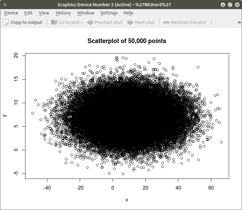
plot(x,y, main=”Scatterplot of 50,000 points”)
####################################################

screenshot-graphics-device-number-2-active-%27rkward%27

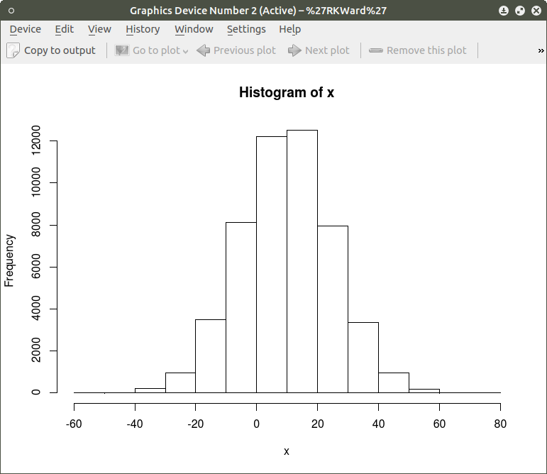
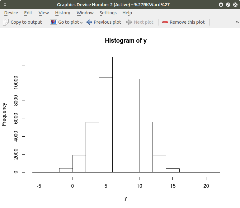
As can be seen the resulting plot is mostly a mass of black with relatively few individual x and y points shown other than the outliers.  We can do a quick histogram on the x values and the y values to check the normality of the resulting distribution. This shown in the code below:
####################################################
## show histogram of x and y distribution
####################################################
hist(x)   ## histogram for x mean=10; sd=15; n=50,000
##
hist(y)   ## histogram for y mean=7; sd=3; n-50,000
####################################################

screenshot-graphics-device-number-2-active-%27rkward%27-5

screenshot-graphics-device-number-2-active-%27rkward%27-4

The histogram shows a normal distribution for both variables. As is expected, in the x vs. y scatterplot the center mass of points is located at the x = 10; y=7 coordinate of the graph as this coordinate contains the mean of each distribution. A more meaningful scatterplot of the dataset can be generated using a the R functions smoothScatter() and heatscatter(). The smoothScatter() function is located in the graphics package and the heatscatter() function is located in the LSD package.

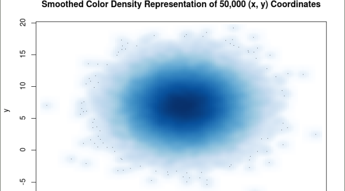
The smoothScatter() function creates a smoothed color density representation of a scatterplot. This allows for a better visual representation of the density of individual values for the x and y pairs. To use the smoothScatter() function with the large dataset created above use the following code:

##############################################
## use smoothScatter function to visualize the scatterplot of #50,000 x ## and y values
## the x and y values should still be in the workspace as #created  above with the rnorm() function
##
smoothScatter(x, y, main = “Smoothed Color Density Representation of 50,000 (x,y) Coordinates”)
##
####################################################

screenshot-graphics-device-number-2-active-%27rkward%27-6

The resulting plot shows several bands of density surrounding the coordinates x=10, y=7 which are the means of the two distributions rather than an indistinguishable mass of dark points.

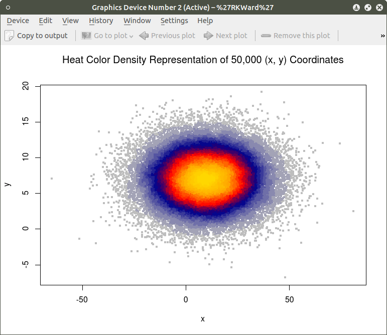
Similar results can be obtained using the heatscatter() function. This function produces a similar visual based on densities that are represented as color bands. As indicated above, the LSD package should be installed and loaded to access the heatscatter() function. The resulting code is:

##############################################
## produce a heatscatter plot of x and y
##
library(LSD)
heatscatter(x,y, main=”Heat Color Density Representation of 50,000 (x, y) Coordinates”) ## function heatscatter() with #n=50,000
####################################################

screenshot-graphics-device-number-2-active-%27rkward%27-7

In comparing this plot with the smoothScatter() plot one can more clearly see the distinctive density bands surrounding the coordinates x=10, y=7. You may also notice depending on the computer you are using that there is a noticeably longer processing time required to produce the heatscatter() plot.

This tutorial has hopefully provided some useful information relative to visual displays of large data sets. In the next segment I will discuss how these techniques can be used on a live database containing millions of cases.

R for Beginners: Some Simple Code to Produce Informative Graphs, Part One


A Tutorial by D. M. Wiig

The R programming language has a multitude of packages that can be used to display various types of graph. For a new user looking to display data in a meaningful way graphing functions can look very intimidating. When using a statistics package such as SPSS, Stata, Minitab or even some of the R Gui’s such R Commander sophisticated graphs can be produced but with a limited range of options. When using the R command line to produce graphics output the user has virtually 100 percent control over every aspect of the graphics output.

For new R users there are some basic commands that can be used that are easy to understand and offer a large degree of control over customisation of the graphical output. In part one of this tutorial I will discuss some R scripts that can be used to show typical output from a basic correlation and regression analysis.

For the first example I will use one of the datasets from the R MASS dataset package. The dataset is ‘UScrime´ which contains data on certain factors and their relationship to violent crime. In the first example I will produce a simple scatter plot using the variables ‘GDP’ as the independent variable and ´crimerate´ the dependent variable which is represented by the letter ‘y’ in the dataset.

Before starting on this project install and load the R package ‘MASS.’ Other needed packages are loaded when R is started. The scatter plot is produced using the following code:

####################################################
### make sure that the MASS package is installed
###################################################
library(MASS)   ## load MASS
attach(UScrime)   ## use the UScrime dataset
## plot the two dimensional scatterplot and add appropriate #labels
#
plot(GDP, y,
main=”Basic Scatterplot of Crime Rate vs. GDP”,
xlab=”GDP”,
ylab=”Crime Rate”)
#
####################################################

The above code produces a two-dimensional plot of GDP vs. Crimerate. A regression line can be added to the graph produced by including the following code:

####################################################
## add a regression line to the scatter plot by using simple bivariate #linear model
## lm generates the coefficients for the regression model.extract
## col sets color; lwd sets line width; lty sets line type
#
abline(lm(y ~ GDP), col=”red”, lwd=2, lty=1)
#
####################################################

As is often the case in behavioral research we want to evaluate models that involve more than two variables. For multivariate models scatter plots can be generated using a 3 dimensional version of the R plot() function. For the above model we can add a third variable ‘Ineq’ from the dataset which is a measure the distribution of wealth in the population. Since we are now working with a multivariate linear model of the form ‘y = b1(x1) + b2(x2) + a’ we can use the R function scatterplot3d() to generate a 3 dimensional representation of the variables.

Once again we use the MASS package and the dataset  ‘UScrime’ for the graph data. The code is seen below:

####################################################
## create a 3d graph using the variables y, GDP, and Ineq
####################################################
#
library(scatterplot3d)   ##load scatterplot3d function
require(MASS)
attach(UScrime)   ## use data from UScrime dataset
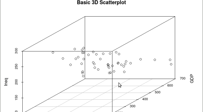
scatterplot3d(y,GDP, Ineq,
main=”Basic 3D Scatterplot”) ## graph 3 variables, y
#
###################################################

The following graph is produced:

screenshot-graphics-device-number-2-active-%27rkward%27

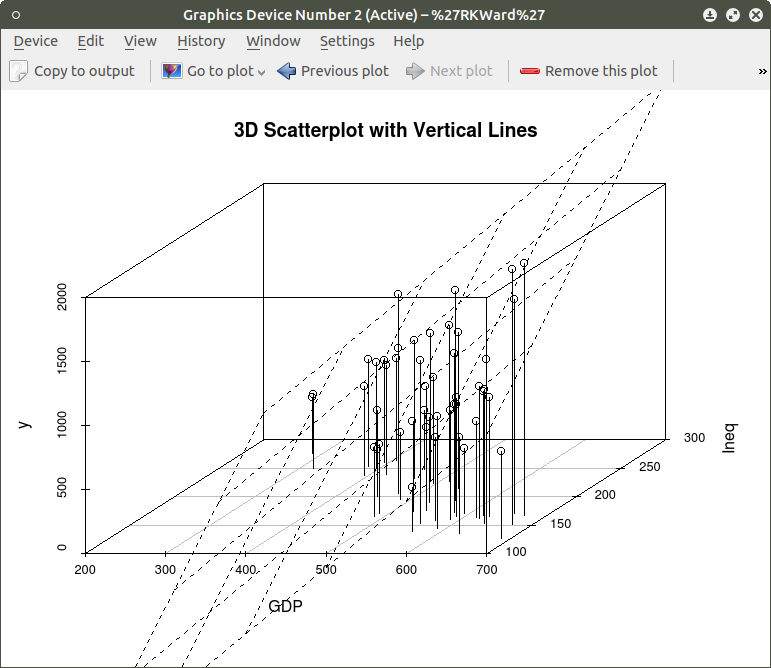
The above code will generate a basic 3d plot using default values. We can add straight lines from the plane of the graph to each of the data points by setting the graph type option as ‘type=”h”, as seen in the code below:

##############################################

require(MASS)
library(scatterplot3d)
attach(UScrime)
model <- scatterplot3d(GDP, Ineq, y,
type=”h”, ## add vertical lines from plane with this option
main=”3D Scatterplot with Vertical Lines”)
####################################################

This results in the graph:

screenshot-graphics-device-number-2-active-%27rkward%27-1

There are numerous options that can be used to go beyond the basic 3d plot. Refer to CRAN documentation to see these. A final addition to the 3d plot as discussed here is the code needed to generate the regression plane of our linear regression model using the y (crimerate), GDP, and Ineq variables. This is accomplished using the plane3d() option that will draw a plane through the data points of the existing plot. The code to do this is shown below:

##############################################
require(MASS)
library(scatterplot3d)
attach(UScrime)
model <- scatterplot3d(GDP, Ineq, y,
type=”h”,   ## add vertical line from plane to data points with this #option
main=”3D Scatterplot with Vertical Lines”)
## now calculate and add the linear regression data
model1 <- lm(y ~ GDP + Ineq)   #
model$plane3d(model1)   ## link the 3d scatterplot in ‘model’ to the ‘plane3d’ option with ‘model1’ regression information
#
####################################################

The resulting graph is:

screenshot-graphics-device-number-2-active-%27rkward%27-2

To draw a regression plane through the data points only change the ‘type’ option to ‘type=”p” to show the data points without vertical lines to the plane. There are also many other options that can be used. See the CRAN documentation to review them.

I have hopefully shown that relatively simple R code can be used to generate some informative and useful graphs. Once you start to become aware of how to use the multitude of options for these functions you can have virtually total control of the visual presentation of data. I will discuss some additional simple graphs in the next tutorial that I post.

R For Beginners: Some Simple R Code to do Common Statistical Procedures, Part Two


An R tutorial by D. M. Wiig

This posting contains an embedded Word document. To view the document full screen click on the icon in the lower right hand corner of the embedded document.


R For Beginners: A Video Tutorial on Installing and Using the Deducer Statistics Package


R For Beginners:  A Video Tutorial on Installing and Using the Deducer Statistics Package with the R Console

In previous tutorials I have discussed the use of R Commander and Deducer statistical packages that provide a menu based GUI for R.  In this video tutorial I will discuss downloading and installing the Deducer statistics package.  This video is designed to support my previous tutorial on the same subject.

I have embedded the video below,   I hope you find this tutorial  a useful adjunct to installing and using the menu based Deducer package.

This document is an embedded Word document.  To view it full screen click on the icon in the lower right corner of the screen


R For Beginners: Installing the JGR GUI On a Linux Platform


A Tutorial by D. M. Wiig

This is an embedded Word document.  To view it full screen click on the icon in the lower right cornet of the document.

Watch for more tutorials discussing  R statistics on a Linux platform.

How to Install the Latest Version of R Statistics on Your Raspberry Pi


R for Beginners:  How to Install the Latest Version of R Statistics on Your Raspberry Pi

A tutorial by D. M. Wiig

One of the nice characteristics of open source software such as R is the rapid development of new releases and updates.  While the base core remains stable for a period of time there is a considerable amount of updating,  adding, and removing the component packages.  At the time of this writing the latest iteration is R version 3.3.1, “Bug in Your Hair.” If you are using a Windows platform you will likely go directly to the archive web site and download the latest distribution as a Windows executable installation package.

If you are using a Linux distribution  such as Ubuntu or Debian, the process of adding software is usually accomplished via the menu based installer.  These software installers allow  R and its dependencies to be downloaded from the community archive.

One of the disadvantages of using this approach is that the versions of some software in the community archives may not be updated to the latest version.  This is often the case with R as well as with many other software packages.

To insure that you are downloading the latest R version you need to use the platform’s command line to install what is needed.  You can add the URL’s of some backport archives that are more likely to be kept up to date with current releases.  As an example In this tutorial I will use the R statistical software that I am running on my Raspberry Pi 3 board with a Raspbian OS and the new PIXEL desktop.

Regardless of which Linux distribution you are using first open a command console from the desktop menu. Make sure all is up to date by using the command:

pi@raspberrypi:~ $ sudo apt-get update
This will insure all appropriate packages currently installed are running the latest updates.  If you are running a Raspbian distribution such as jessie you will need to edit the /etc/apt/sources.list file to add a backport to the latest version of R.  Start the nano editor by using the command:

sudo nano /etc/apt/sources.list

This should produce the output as seen below:

pi@raspberrypi:~ $ sudo nano /etc/apt/sources.list

------------------------------------------------
GNU nano 2.2.6 File: /etc/apt/sources.list

deb http://mirrordirector.raspbian.org/raspbian/ jessie main contrib non-free r$
# Uncomment line below then 'apt-get update' to enable 'apt-get source'
deb-src http://archive.raspbian.org/raspbian/ jessie main contrib non-free rpi
deb http://archive.raspbian.org/raspbian/ stretch main
deb http://mirror.las.iastate.edu/CRAN/bin/linux/debian/ jessie main
deb http://mirror.las.iastate.edu/CRAN/bin/linux/ubuntu xenial/

[ Read 8 lines ]
^G Get Help ^O WriteOut ^R Read File ^Y Prev Page ^K Cut Text ^C Cur Pos
^X Exit ^J Justify ^W Where Is ^V Next Page ^U UnCut Text^T To Spell

As is seen above there are several lines containing the standard  Raspbian archives to search.


If you are using a Debian distribution you would add the following line to the file:

http://mirror.las.iastate.edu/CRAN/bin/linux/debian/ jessie main

Replace the 'jessie' portion with the name of the specific Debian distribution you are using replace the 'mirror' portion with the R CRAN mirror that you use.  You also need to add the line that provides the URL of a Raspian 'stretch' archive that contains the most recent updates of many different software packages.  In my case I was looking for the latest R release, but you should search this this archive for the latest version of any software package you are installing.

If you are using an Ubuntu distribution add a line with the appropriate changes for the specific Ubuntu distribution that you are using. 
Check with the documentation provided with your specific Linux distribution to see if there is also a 'stretch' archive maintained for new versions. 

Once these changes are made exit the nano editor using the ^O key command to write the file and then the ^X key command to return to the command line.  You should now be able to issue the command:

pi@raspberrypi:~ $ sudo apt-get install r-base r-base-core r-base-dev

Once the download and install processes have completed you should now be able to invoke R from the command line or menu and see the latest version:

pi@raspberrypi:~ $ R

R version 3.3.2 RC (2016-10-23 r71578) -- "Sincere Pumpkin Patch"
Copyright (C) 2016 The R Foundation for Statistical Computing
Platform: arm-unknown-linux-gnueabihf (32-bit)

R is free software and comes with ABSOLUTELY NO WARRANTY.
You are welcome to redistribute it under certain conditions.
Type 'license()' or 'licence()' for distribution details.

 Natural language support but running in an English locale

R is a collaborative project with many contributors.
Type 'contributors()' for more information and
'citation()' on how to cite R or R packages in publications.

Type 'demo()' for some demos, 'help()' for on-line help, or
'help.start()' for an HTML browser interface to help.
Type 'q()' to quit R.

> 


For other Linux distributions you would add a line similar to the above examples in the /etc/apt/sources.list. Check the documentation for your specific Linux platform for further information about backport archives.

R Video Tutorial For Beginners: Installing And Using the Rcommander GUI


R Video Tutorial For Beginners: Installing And Using the Rcommander GUI

A tutorial video by D. M. Wiig

In my recent series of tutorials for those interested in the R statistical programming language I have discussed both the installation and use of the R console and R Commander statistics GUI.  Before viewing the tutorial make sure the R Commander package has been download into your R library via the Install Packages menu option.  This procedure was discussed in the previously posted R Commander tutorial.

Relative to this first tutorial I have have created a video that covers the initial installation of R Commander.  The video is seen below:

Click the icon in the lower right side of the screen to view the tutorial in full screen mode.

I hope that you find this useful in your pursuit of learning about  R statistics.

R for Beginners: Using R Commander in an Introductory Statistics Course


R for beginners:  Using R Commander in introductory statistics courses

A tutorial by D. M. Wiig

As with previous tutorials in this series this document is an embedded Word documents.  To view the document full screen click on the icon in the lower right corner of the window.