
A simple R script to create and analyze a data file:part two: A tutorial by D.M. Wiig
In part one I discussed creating a simple data file containing the height and weight of 10 subjects. In part two I will discuss the script needed to create a simple scatter diagram of the data and perform a basic Pearson correlation. Before attempting to continue the script in this tutorial make sure that you have created and save the data file as discussed in part one.
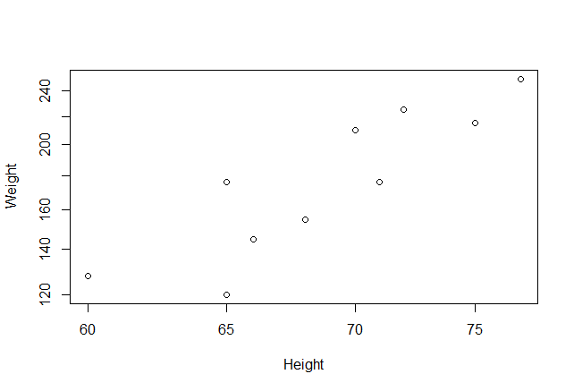
To conduct a correlation/regression analysis of the data we want to first view a simple scatter plot. Load a library named ‘car’ into R memory. Use the command:
> library(car)
Then issue the following command to plot the graph:
> plot(Height~Weight, log=”xy”, data=Sampledatafile)
The output is seen below:
We can calculate a Pearson’s Product Moment correlation coefficient by using the command:
> # Pearson rank-order correlations between height and weight
> cor(Sampledatafile[,c(“Height”,”Weight”)], use=”complete.obs”, method=”pearson”)
Which results in:
Height Weight
Height 1.0000000 0.8813799
Weight 0.8813799 1.0000000
To run a simple linear regression for Height and Weight use the following code. Note that the dependent variable (Weight) is listed firt:
> model <-lm(Weight~Height, data=Sampledatafile)
> summary(model)
Call:
lm(formula = Weight ~ Height, data = Sampledatafile)
Residuals:
Min 1Q Median 3Q Max
-30.6800 -16.9749 -0.8774 19.9982 25.3200
Coefficients:
Estimate Std. Error t value Pr(>|t|)
(Intercept) -337.986 98.403 -3.435 0.008893 **
Height 7.518 1.425 5.277 0.000749 ***
—
Signif. codes: 0 ‘***’ 0.001 ‘**’ 0.01 ‘*’ 0.05 ‘.’ 0.1 ‘ ’ 1
Residual standard error: 21.93 on 8 degrees of freedom
Multiple R-squared: 0.7768, Adjusted R-squared: 0.7489
F-statistic: 27.85 on 1 and 8 DF, p-value: 0.0007489
>
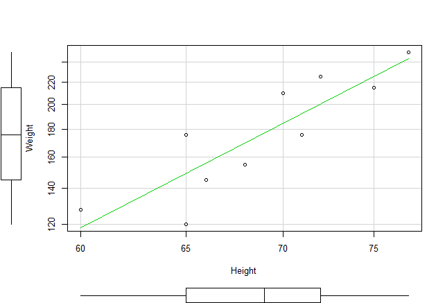
To plot a regression line on the scatter diagram use the following command line. Note that we enter the y (dependent)variable first and then the x (independent)variable:
> scatterplot(Weight~Height, log=”xy”, reg.line=lm, smooth=FALSE, spread=FALSE,
+ data=Sampledatafile)
>
This will produce a graph as seen below. Note that box plots have also been included in the output:
This tutorial has hopefully demonstrated that complex tasks can be accomplished with relatively simple command line script. I will explore more of these simple scripts in future tutorials.
More to Come:
