An R Tutorial by D. M. Wiig
In previous tutorials I have discussed the basics of creating a ternary plot using the ggtern package using a simple hypothetical data frame containing five values. In a subsequent tutorial I discussed the application by creating a ternary graph using election results from the British House of Commons from the last half of the 20th century. This type of plot creates a very nice visual of the effects of a third party on the election outcome.
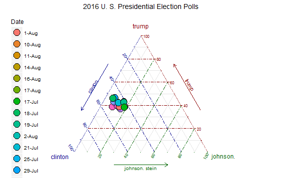
In this tutorial I will discuss using the same technique as applied to recent polling data from the ongoing 2016 U.S. presidential campaign. Before discussing the current election campaign I am going to refresh your memory relative to using the ggtern package.
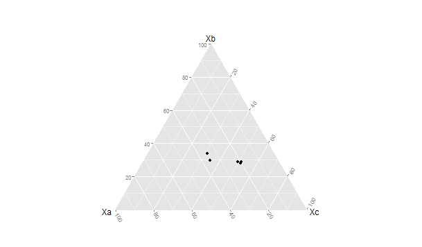
Before running the script in this tutorial make sure that the packages ggplot, ggplot2, and ggtern are loaded into your R environment. Please also note the you will need a recent version of R that is version 3.1.x or newer. A very basic graph can be easily constructed. I will the use theoretical quantities XA , XB , and XC to demonstrate a basic ternary diagram. In this simple example I will create a sample of n=5 by entering the data from the keyboard into a data frame ‘sampfile.’ To invoke the editor use the following code:
###################################################
#create a sample file of n=5
###################################################
sampfile <-data.frame(Xa=numeric(0),Xb=numeric(0),Xc=numeric(0))
sampfile <-edit(sampfile)
###################################################
This will open up a data entry sheet with three columns labeled Xa, Xb, and Xc. The number that are entered do not matter for purposes of this illustration. The table I entered is as follows:
Xa Xb Xc
1 100 135 250
2 90 122 210
3 98 44 256
4 100 97 89
5 90 75 89
To produce a very basic ternary diagram with the above data set use the code segment:
##################################################
#do basic graph with sample data
##################################################
ggtern(data=sampfile, aes(x=Xa,y=Xb, z=Xc)) + geom_point()
##################################################
This produces the graph seen below: