All posts by dmwiig

Retired Professor of Political Science. I specialized in social science statistics, research methods and comparative political analysis. Author of tutorials discussing R statistics programming.

R For Beginners: Installing and Using the R Console in a Windows Environment


An R tutorial by D. M. Wiig

This tutorial is posted as an embedded Word document. To view the document full screen click on the icon in the lower-right corner of the document window.

My next post covering installing and using the Rcommander GUI will be out in a day or two.

Using R to Create Ternary Diagrams: An Example Using 2016 Presidential Polling Data


An R Tutorial by D. M. Wiig

In previous tutorials I have discussed the basics of creating a ternary plot using the ggtern package using a simple hypothetical data frame containing five values. In a subsequent tutorial I discussed the application by creating a ternary graph using election results from the British House of Commons from the last half of the 20th century. This type of plot creates a very nice visual of the effects of a third party on the election outcome.

In this tutorial I will discuss using the same technique as applied to recent polling data from the ongoing 2016 U.S. presidential campaign. Before discussing the current election campaign I am going to refresh your memory relative to using the ggtern package.

Before running the script in this tutorial make sure that the packages ggplot, ggplot2, and ggtern are loaded into your R environment. Please also note the you will need a recent version of R that is version 3.1.x or newer. A very basic graph can be easily constructed. I will the use theoretical quantities XA , XB , and XC to demonstrate a basic ternary diagram. In this simple example I will create a sample of n=5 by entering the data from the keyboard into a data frame ‘sampfile.’ To invoke the editor use the following code:

###################################################

#create a sample file of n=5

###################################################

sampfile <-data.frame(Xa=numeric(0),Xb=numeric(0),Xc=numeric(0))

sampfile <-edit(sampfile)

###################################################

This will open up a data entry sheet with three columns labeled Xa, Xb, and Xc. The number that are entered do not matter for purposes of this illustration. The table I entered is as follows:

Xa      Xb      Xc

1 100   135   250

2 90     122    210

3 98      44     256

4 100   97     89

5 90     75     89

To produce a very basic ternary diagram with the above data set use the code segment:

##################################################

#do basic graph with sample data

##################################################

ggtern(data=sampfile, aes(x=Xa,y=Xb, z=Xc)) + geom_point()

##################################################

This produces the graph seen below:

A Simple Ternary Diagram


The triangular representation of the dimensions Xa →Xb, Xc → Xa and Xb →Xc allow each case to be represented as a single point located relative to each of the three vectors. There are a large number of additions, modifications and tweaks that can be done to this basic pattern. In the next tutorial I will discuss generating a more elaborate ternary diagram using polling data from the current U.S. presidential campaign.

Thu US has a two party dominant system with several minor parties that regularly contest elections. In the current presidential election campaign there are the two major party candidates as well as two minor party candidates for the Libertarian and Green parties that are being included in the numerous public opinion polls that are being done nationally.

For purposes of this example I have added the percentages for these two minor parties together. This results in three variables that are being plotted, the percentage for Clinton (Democrat), Trump (Republican), and for the combined Johnson (Libertarian) and Stein (Green). By plotting the three variables over time on a ternary diagram we can visualize any changes in the mixture of support indicated for the candidates.

The poll data used in this project were taken from the web site RealClearPolitics.com for the time period from July 29 to August 18.¹ It should be noted that the poll numbers were not necessarily from the same polling organization for each date but all polls used were listed as being national in scope with a Clinton v. Trump v. Johnson v. Stein format.

Before working through this tutorial make sure that you have the ggplot, ggplot2, and ggtern packages loaded into your R environment.² I originally created the table shown above using Excel and then converted it into a *cvs format before importing it into R studio for analysis.³ The data can be entered directly via the R data editor as shown in the previous example. The code segment below was used to load the *csv format file:

####################################################Enter data into spreadsheet and save a a *csv file

#Load the data into a table using the read.table function

polldata <- read.table(“d:/16electiondata.csv”, header = TRUE, sep=”,”)

#Make sure the table is ok

View(polldata)

###################################################

date                 clinton trump johnson/stein
17-Aug              41          35                  10
16-Aug              43          37                  15
14-Aug              42          37                  12
11-Aug              43          40                  10
10-Aug              44         40                   13
9-Aug                 44         38                   14
8-Aug                 50         37                     9
7-Aug                 45         37                   12
5-Aug                 39         35                   17
4-Aug                 43         34                   15
2-Aug                 42         38                   13
1-Aug                 45         37                   14
30-Jul                46          41                    8
29-Jul                37          37                    6
25-Jul                39          41                   15
21-Jul                38          35                    0
19-Jul                39          40                   15
18-Jul                45          43                    6
17-Jul                42          37                   18

Once the data set is loaded use the following code to create the ternary diagram. Note that in this diagram we are using the base code as shown in the first tutorial with some additions that make the diagram easier to interpret such as the vector arrows and legend. The code segment is:

###################################################

#create ternary plot using percentage polled for each candidate for each polling period

#uses enhanced formatting for easier interpretation

#results of ggtern function are placed in variable ‘plot’ for rendering

###################################################

plot <- ggtern(data = polldata, aes(x = clinton, y = trump, z = johnson.stein)) +

geom_point(aes(fill = date),


size = 6,

shape = 21,

color = “black”) +

ggtitle(“2016 U.S. Presidential Election Polls”) +

labs(fill = “Date”) +

theme_rgbw() +

theme(legend.position = c(0,1),

legend.justification = c(1, 1))

###################################################

To show the diagram simply use:

###################################################

#now plot the diagram

###################################################

plot

###################################################

The resulting ternary diagram is:

2016ternplot

Each point on the graph represents the percentage of support for each of the three candidates by the location of the point on the 3-way graph axes. This R routine provides a quick and straightforward method for representing a 3-dimensional relationship in two dimensions.

Code segments in this article were written using R Studio Version 0.98.993 running R version 3.1.1  in a Windows 7 environment.

Notes:

¹As indicated above the poll data used in this tutorial was located at http://realclearpolitics.com. This website is an excellent source of information about all aspects of American electoral politics.

² For additional information about ternary graphs see the website http://www.ggtern.com. See also the CRAN website at http://cran.r-project.org/web/packages/ggtern/ggtern.pdf.

³For information about using the IDE R Studio see the website https://www.rstudio.com

Using R to Create Ternary Graphs


I am currently working on an updated posting of my tutorial
Ternary Diagrams Using R: An Example Using Election Outcomes.

The new tutorial will explore using ternary diagrams to track shifts in support for presidential candidates in the 2016 US presidential campaign.

Check back soon for the first installment!

R-Fiddle R Console and Data Editor: R Collaboration in the Cloud


R-Fiddle is a great tool to develop and test  code segments or complete R programs.   By accessing the R-Fiddle web site users have a fully functioning R console,  code editor and discussion board all in one place.  If a user has code uploaded that has been designated to share,  other users can access the code and make suggestions or additions.  Code can be run with full R support from your web browser.

Try the link below to test out R-Fiddle.  I have uploaded a small program as a demo.  Feel free to share your own projects,  help others or try out code segments.

http://www.r-fiddle.org/#/embed?id=rtOt8yR3

Click in the link above to activate the R editor and R console.

Ternary Diagrams Using R: An Example Using Election Outcomes


Ternary Diagrams Using R:  An Example Using Election Outcomes

A tutorial by D. M. Wiig

In part one of this tutorial I discussed creating a ternary diagram using a simple data frame that contained five hypothetical cases. In this tutorial I will expand on that foundation by creating a more informative ternary diagram using live data.

A useful application of this package in social science research is creating a visual display of parliamentary election outcomes. Specifically we can use a ternary graph to examine the distribution of seats in the British House of Commons over a period of time. Since the UK uses a proportional system to allocate seats in the House of Commons there can be a variety of outcomes in any given national election.

Since 1945 general elections in the UK have produced a division of seats among the Labour, Conservative, and various minor parties. To demonstrate how this division of seats can be shown over time data was collected for all of the general elections from the years 1945 to 2015. These data show the percentage of the popular vote won by each party and the number of seats allocated to that party based on the vote division(retrieved from http://www.ukpolitical.info).  I have created a summary table of these results as follows:

Year   Con   Lab   LD+Other   SeatsCon   SeatsLab   SeatsOther

2015  36.9  30.4      32.7                331                232                 95

2010  36.1   29         34.9                 306               258                  85

2005  35.2   32.4    32.4                 355               198                  92

2001 40.7   31.7     27.6                 412               166                   81

1997 43.2  30.7     26.1                  418               165                   76

1992  42.3 35.2     23.5                   336              271                    44

1987  42.2 30.8     27                       375             229                    48

1983  42.4  27.6    26.9                    397             209                   27

1979  43.9 36.9    15.8                     339             268                    28

1974  39.2 35.8    21.8                   319             276                     39

1974  37.1 37.9    20.1                  301             296                     38

1970  46.4   43       8.6                   330             287                    19

1966  47.9 41.9     8.5                   363             253                     25

1964  44.1 53.4   11.2                  317             304                   22

1959  49.4  43.8    5.9                    365           258                    19

1955  49.7  46.4       0                     344            277                   18

1951  48    48.8        2.5                 321            295                   18

1950  46.1 43.5       9.1                315             297                   22

1945  47.8 39.8         1                  393            213                    57

The UK has a two party dominant system with a number of minor parties that regularly contest elections. As indicated above, a proportional representation method of allocating seats is used so these minor parties are able to gain some representation in the Commons. For readers interested in learning more about political parties in the UK there are a number of resources readily available at various online and other sources.

For purposes of this example I have added the popular vote of all minor parties together in the ‘LD+Other’ column, and the number of seats gained in the ‘SeatsOther’ column. By plotting the three variables ‘SeatsCon’, ‘SeatsLab’, and ‘SeatsOther’ by year on a ternary diagram we can visualize any changes in the mixture of seats won for the three groups. Before working through this tutorial make sure that you have the ggplot, ggplot2, and ggtern packages loaded into your R environment.

I originally created the table shown above using Excel and then imported it into R studio for analysis. If you are not using R studio you can enter the data via the R data editor as shown in the previous tutorial, or put the data into an Excel or LibreOffice spreadsheet and import it into R using the read.spss() function that I have discussed in earlier tutorials. You can also use any other method that you are familiar with to get the data into your R environment.

Once the data set is loaded use the following code to create the ternary diagram. Note that in this diagram we are using the base code as shown in the first tutorial with some additions that make the diagram easier to interpret such as the vector arrows and legend. The code segment is:

################################################### #create ternary plot using seats allocated by party for each election #uses enhanced formatting for easier interpretation #results of #ggtern function are placed in ‘plot for rendering ################################################### plot <- ggtern(data = ukvotedata, aes(x = SeatsCon, y = SeatsLab, z = SeatsOther)) +geom_point(aes(fill = Year), size = 4, shape = 21, color = “black”) + ggtitle(“Proportion of Seats Won 1945-2015”) + labs(fill = “Year”) + theme_rgbw() + theme(legend.position = c(0,1), legend.justification = c(0, 1)) ###################################################

To show the diagram simply use:

################################################### #now plot the diagram ################################################### plot ###################################################

The resulting ternary diagram is:

ukfinalplot

Each point on the graph represent the relative division of seats for each of the 19 elections in the table. The shading represents the year with the darkest being 1945 and the lightest 2015. The diagram clearly shows the trend toward more minor party representation and a move away from the two major parties over time. Indeed coalition governments resulted in several of the more recent elections due to the increase in minor party influence.

My purpose here is not to discuss UK politics but to show how ternary diagrams can be used in a social science application. With the many additions and extensions that are being added to the ggtern package it can be a very power device for graphical analysis.

Thanks for Visiting This Blog


I hope you find the information contained on this blog to be of use as you explore R and R programming.  Feel free to help me expand my reach by adding your own tutorials that you have written or perhaps papers that you have delivered or are preparing for conferences or publication.  Just remember the goal of this blog is to explore and facilitate R statistics and programming and the use of R in a number of environments.

Doug W.

Ternary Diagrams Using R: The ggtern Package


Ternary Diagrams Using R: The ggtern Package

A tutorial by Douglas M. Wiig

There are a number of very useful and popular graphics packages available for R such as lattice, ggplot, ggplot2 and others. Some of these offer general purpose graphics capabilities and others are more specialized. A recently developed extension to the ggplot2 package is ggtern. This package is essentially a wrapper for a number of functions that can be used to create a variety of ternary diagrams. Ternary diagrams are useful when analyzing the relationship among three factors or elements. A ternary diagram essentially represents the proportions of three related factors in two-dimensional space.

Before running the script in this tutorial make sure that the packages ggplot, ggplot2, and ggtern are loaded into your R environment. A basic graph can be easily constructed. I will the use theoretical quantities Xa , Xb , and Xc to demonstrate a basic ternary diagram. In this simple example I will create a sample of n=5 by entering the data from the keyboard into a data frame ‘sampfile.’ To invoke the editor use the following code:

################################################### #create a sample file of n=5 ################################################### sampfile <-data.frame(Xa=numeric(0),Xb=numeric(0),Xc=numeric(0)) sampfile <-edit(sampfile) ###################################################

This will open up a data entry sheet with three columns labeled Xa, Xb, and Xc. The number that are entered do not matter for purposes of this illustration. The table I entered is as follows:
Xa      Xb        Xc

1 100  135     250

2 90    122     210

3 98    144    256

4 100    97      89

5  90     75      89

To produce a very basic ternary diagram with the above data set use the command:

################################################## #do basic graph with sample data ################################################## ggtern(data=sampfile,aes(x=Xa,y=Xb, z=Xc))+geom_point() ##################################################

This produces the graph seen below:

ggterm[;ptbasoc
As can be seen the triangular representation of the dimensions Xa →Xb, Xc → Xa and Xb →Xc allow each case to be represented as a single point located relative to each of the three vectors. There are a large number of additions, modifications and tweaks that can be done to this basic pattern.

In the next tutorial I will discuss generating a more elaborate ternary diagram using election outcome data from British general elections. For more information about the ggtern package see the CRAN documentation and information as well as the web site http://www.ggtern.com for all of the latest news and developments.

Using R: Random Sample Selection and One-Way ANOVA


A tutorial by Douglas M. Wiig

In the previous tutorial we looked at the hypothesis that one’s outlook on life is influenced by the amount of education attained. Using the GSS 2014 data file we looked at the education variable ‘educ’, and the outlook on life variable ‘life’, a measure of outlook on life as ‘DULL’, ‘ROUTINE’, or ‘EXCITING.’ We selected a subset for each response category and found that there appeared to be
differences among the mean level of education measured in years for each of the categories of outlook on life. To further examine this we will first randomly select a sample from the data file, look at the
mean education for each category of outlook on life, and evaluate the means using simple one-way ANOVA.

To randomly select a sample from a population of values we can use the sample() function. There are a number of options and variations of the function that are beyond the scope of this tutorial. Since the
variable ‘educ’ is measured in years we can use the sample.int() function which is designed for use with integer values. The general format of the function is:

sample.int(n, size = n, replace = FALSE)

where: n = the size of population the sample is from
size = the size of the sample
replace = FALSE if sampling without replacement; TRUE if sampling with replacement

For this example I will select a sample of n=500 without replacement from the data file containing a total of 2538 cases. The sample data is loaded into a data matrix as it is selected. This will be
accomplished in two steps. In the first step we will load the sample.int() function with the values to use for selecting the sample and put the vector in ‘randsamp2. The code is:

randsamp2 <- sample.int(2538, size=500, replace=FALSE)

To select the sample make sure that make sure that the GSS2014 data file is loaded into the R environment. I previously loaded the data file into a data frame ‘gss14.’  To select the sample and load
it into a data frame ‘randgss2’ the code is:

randgss2 <- gss14[randsamp2,]

Once the sample has been generated we can look at the mean years of education for each of the three responses for outlook on life. We do this by selecting a subset for each response. Use the following
code:

###################################################
#look at educ means by life by selecting 3 subsets from randgss2
###################################################
life12 <- subset(randgss2, life == “DULL”, select=educ)
life22 <- subset(randgss2, life == “ROUTINE”, select=educ)
life32 <- subset(randgss2, life == “EXCITING”, select=educ)

Now run summary statistics for each subset to look at the means:

summary(life12)
summary(life22)
summary(life32)

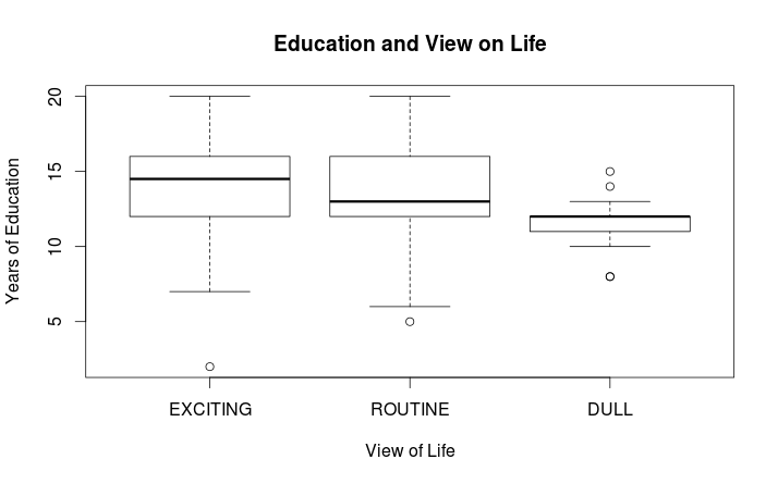
We can now see that the means are as follows:

life12 = 13.0
life22 = 13.29
life 32 = 14.51

and we can generate a summary visual of the differences among the three subsets by doing a simple boxplot using:

###################################################
# do boxplots of the subsets to visualize differences
#boxplot using educ and life variables from the ‘randgss2’ data #frame
###################################################
boxplot(randgss2$educ ~ randgss2$life, main=”Education and View on Life n = 500″, xlab=”View of Life”,ylab=”Years of Education”)

The following graph will result:

Rplotrandgss2

As can be seen above there does appear to be a difference among these means, particularly for those who see life as ‘DULL.’ To see if these differences are significant an ANOVA will be run using the
simple one way ANOVA function aov(). The basic function is:
aov(formula, data = NULL)For our example we use:

model2 <- aov(educ ~ life, data=randgss2)

which analyzes the mean education by category of outlook on life using the randgss2 sample of n=500. The results are stored in ‘model2.’ The output from this operation is shown using the summary() function. This produces the following output:

summary(model2)

Df Sum Sq Mean Sq F value Pr(>F) life
2  171.5    85.77     10.42 4.08e-05 ***
Residuals  332     2732.2  8.23

Signif. codes: 0 ‘***’ 0.001 ‘**’ 0.01 ‘*’ 0.05 ‘.’ 0.1 ‘ ’ 1
165 observations deleted due to missingness

This output shows that at least one of the means differs significantly from the others. To test this difference further we can use a pair-wise comparison of means to see which means differ significantly
from each other. There are several options available. We will use a basic Tukey HSD comparison. This is accomplished using:

##################################################
#run HSD on sample
TukeyHSD(model2)
##################################################

producing the following output:

Tukey multiple comparisons of means
95% family-wise confidence level

Fit: aov(formula = educ ~ life, data = randgss2, projections = TRUE)

$life                               diff                     lwr                upr                    p adj
ROUTINE-EXCITING -1.074404 -1.833686 -0.31512199  .0027590
DULL-EXCITING          -2.729412 -4.447386 -1.01143754  .0006325
DULL-ROUTINE           -1.655008 -3.384551 0.07453525 00640910

By looking at the p value for each comparison it can be seen that both the ROUTINE-EXCITING and DULL-EXCITING means differ significantly at p ≤ .05

I might point out that if a researcher was using the GSS 2014 data file as we used here there would need to be more data preparation prior to running any analysis. For example, there is a fair amount of
missing data as indicated by NA in the raw data file. The missing data would need to be handled in some way. R has numerous functions and packages that can assist in resolving missing data issues of
various types, but a discussion of these is a subject for a future tutorial.
8/7/15                   Douglas M. Wiig                    http://dmwiig.net

Tutorial: Using R to Analyze NORC GSS Social Science Data, Part Six, R and ANOVA


Tutorial: Using R to Analyze NORC GSS Social Science Data, Part Six, R and ANOVA

A tutorial by Douglas M. Wiig

As discussed in previous segments of this tutorial, for anyone interested in researching social science questions there is a wealth of survey data available through the National Opinion Research Center (NORC) and its associated research universities. The Center has been conducting a national survey each year since 1972 and has compiled a massive database of data from these surveys. Most if not all of these data files can be accessed and downloaded without charge. I have been working with the 2014 edition of the data and for all part of this tutorial will use the GSS2014 data file that is available for download on the Center’s web site. (See the NORC main website at http://www.norc.org/Research/Projects/Pages/general-social-survey.aspx and at http://www3.norc.org/GSS+Website ).

Accessing and loading the NORC GSS2014 data set was discussed in part one of this tutorial. Refer to it if you need specific information on downloading the data set in STATA or SPSS format.  In this segment we will use the subset function to select a desired set of cases from all of the cases in the data file that meet certain criteria.  As indicated in my previous tutorial the GSS2014 data set contains a
total of 2588 cases and 866 variables.

Before starting this segment of the tutorial be sure that the foreign
package is installed and loaded into your R session. As I have indicated in previous tutorials, use of an IDE such as R Studio greatly facilitates entering and debugging R code when doing research such as is discussed in my tutorials.  

Import the GSS 2014 data file in SPSS format and load it into the data frame ‘gss14’ using:
#########################################################import  GSS2014 file in SPSS .sav format
#uses foreign package
########################################################require(foreign)
gss14<- read.spss("/path to your location/GSS2014.sav",                      use.value.labels=TRUE,max.value.labels=Inf, to.data.frame=TRUE)
#################################################

In this tutorial the analysis of this sample will focus on examining the hypothesis “An individual’s outlook on life is influenced by the amount of education the person has attained.” The GSS variables ‘educ’, education in number of years and ‘life’, whether the respondent rated life DULL, ROUTINE, or EXCITING. A simple approach to testing this hypothesis is to compare mean levels of education for each of the three categories of response. I will do this analysis in two stages. In the first stage I will use techniques discussed in a previous tutorial to select a subset of each response category and display the mean education level for each of the three categories.

The three subsets life1, life2, and life3 are generated using the following code:

###################################################
# create 3 subsets from gss14 view on life by years of education
##################################################

life1 <- subset(gss14, life == “DULL”, select=educ)

life2 <- subset(gss14, life ==”ROUTINE”, select=educ)

life3 <- subset(gss14, life == “EXCITING”, select=educ)

###################################################

#The three means of the subsets are displayed using the code:

# run summary statistics for each subgroup

##################################################

summary(life1)

summary(life2)

summary(life3)

###################################################

resulting the following output:
educ
Min. : 0.00
1st Qu.:10.00
Median :12.00
Mean :11.78
3rd Qu.:13.00
Max. :20.00

summary(life2)
educ
Min. : 0.00
1st Qu.:12.00
Median :13.00
Mean :13.22
3rd Qu.:16.00
Max. :20.00
NA’s :1

summary(life3)
educ
Min. : 2.00
1st Qu.:12.00
Median :14.00
Mean :14.31
3rd Qu.:16.00
Max. :20.00

As is seen above there does appear to be a difference among mean years of education and the corresponding outlook on life. In order to examine whether or not these observed differences are not due to chance a simple one-way Analysis of Variance can be generated.

In the next tutorial I will discuss performing the ANOVA and using pair-wise comparisons to determine which if any means are different.

Peppermint 6 OS is one Sweet Platform


I have spent the past week or two working with Peppermint operating system  v. 6.  This is an operating system that is a hybrid with Google’s Chrome operating system integrated with an Ubuntu platform.  Peppermint OS provides a fast easy to use GUI and is optimized for using Google based cloud tools.

The idea is to keep the clutter to a minimum on the home computer and utilize the cloud to advantage with the numerous Google tools and applications that are available.  Of course, Peppermint OS is free and open source.  The degree of customization possible is only limited by the users imagination and programming abilities.

I will write more on this later as I  utilize more of the programs features.  Check out the Peppermint OS web site at:

http://www.peppermintos.com