A Tutorial by D. M. Wiig
The R programming language has a multitude of packages that can be used to display various types of graph. For a new user looking to display data in a meaningful way graphing functions can look very intimidating. When using a statistics package such as SPSS, Stata, Minitab or even some of the R Gui’s such R Commander sophisticated graphs can be produced but with a limited range of options. When using the R command line to produce graphics output the user has virtually 100 percent control over every aspect of the graphics output.
For new R users there are some basic commands that can be used that are easy to understand and offer a large degree of control over customisation of the graphical output. In part one of this tutorial I will discuss some R scripts that can be used to show typical output from a basic correlation and regression analysis.
For the first example I will use one of the datasets from the R MASS dataset package. The dataset is ‘UScrime´ which contains data on certain factors and their relationship to violent crime. In the first example I will produce a simple scatter plot using the variables ‘GDP’ as the independent variable and ´crimerate´ the dependent variable which is represented by the letter ‘y’ in the dataset.
Before starting on this project install and load the R package ‘MASS.’ Other needed packages are loaded when R is started. The scatter plot is produced using the following code:
####################################################
### make sure that the MASS package is installed
###################################################
library(MASS) ## load MASS
attach(UScrime) ## use the UScrime dataset
## plot the two dimensional scatterplot and add appropriate #labels
#
plot(GDP, y,
main=”Basic Scatterplot of Crime Rate vs. GDP”,
xlab=”GDP”,
ylab=”Crime Rate”)
#
####################################################
The above code produces a two-dimensional plot of GDP vs. Crimerate. A regression line can be added to the graph produced by including the following code:
####################################################
## add a regression line to the scatter plot by using simple bivariate #linear model
## lm generates the coefficients for the regression model.extract
## col sets color; lwd sets line width; lty sets line type
#
abline(lm(y ~ GDP), col=”red”, lwd=2, lty=1)
#
####################################################
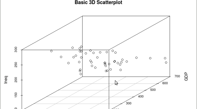
As is often the case in behavioral research we want to evaluate models that involve more than two variables. For multivariate models scatter plots can be generated using a 3 dimensional version of the R plot() function. For the above model we can add a third variable ‘Ineq’ from the dataset which is a measure the distribution of wealth in the population. Since we are now working with a multivariate linear model of the form ‘y = b1(x1) + b2(x2) + a’ we can use the R function scatterplot3d() to generate a 3 dimensional representation of the variables.
Once again we use the MASS package and the dataset ‘UScrime’ for the graph data. The code is seen below:
####################################################
## create a 3d graph using the variables y, GDP, and Ineq
####################################################
#
library(scatterplot3d) ##load scatterplot3d function
require(MASS)
attach(UScrime) ## use data from UScrime dataset
scatterplot3d(y,GDP, Ineq,
main=”Basic 3D Scatterplot”) ## graph 3 variables, y
#
###################################################
The following graph is produced:

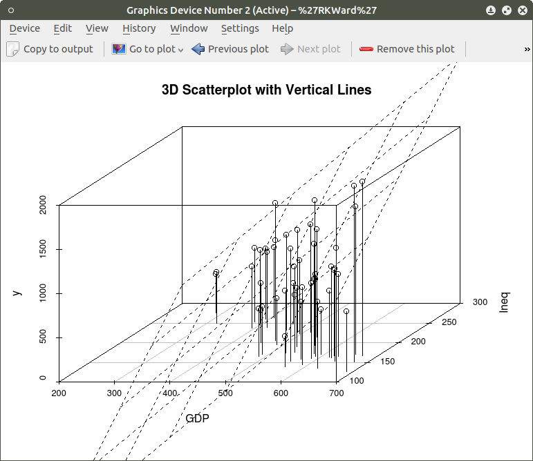
The above code will generate a basic 3d plot using default values. We can add straight lines from the plane of the graph to each of the data points by setting the graph type option as ‘type=”h”, as seen in the code below:
##############################################
require(MASS)
library(scatterplot3d)
attach(UScrime)
model <- scatterplot3d(GDP, Ineq, y,
type=”h”, ## add vertical lines from plane with this option
main=”3D Scatterplot with Vertical Lines”)
####################################################
This results in the graph:

There are numerous options that can be used to go beyond the basic 3d plot. Refer to CRAN documentation to see these. A final addition to the 3d plot as discussed here is the code needed to generate the regression plane of our linear regression model using the y (crimerate), GDP, and Ineq variables. This is accomplished using the plane3d() option that will draw a plane through the data points of the existing plot. The code to do this is shown below:
##############################################
require(MASS)
library(scatterplot3d)
attach(UScrime)
model <- scatterplot3d(GDP, Ineq, y,
type=”h”, ## add vertical line from plane to data points with this #option
main=”3D Scatterplot with Vertical Lines”)
## now calculate and add the linear regression data
model1 <- lm(y ~ GDP + Ineq) #
model$plane3d(model1) ## link the 3d scatterplot in ‘model’ to the ‘plane3d’ option with ‘model1’ regression information
#
####################################################
The resulting graph is:
To draw a regression plane through the data points only change the ‘type’ option to ‘type=”p” to show the data points without vertical lines to the plane. There are also many other options that can be used. See the CRAN documentation to review them.
I have hopefully shown that relatively simple R code can be used to generate some informative and useful graphs. Once you start to become aware of how to use the multitude of options for these functions you can have virtually total control of the visual presentation of data. I will discuss some additional simple graphs in the next tutorial that I post.

Very useful
Thanks
LikeLike
Very helpful thanks. I am looking to create a scatter plot in a sphere and the ability to label each plot point, any suggestions?
LikeLike
Can you also add a small part on how you would analyze the data per graphs created?
LikeLike
Hi thanks for pposting this
LikeLike