Tag Archives: r code

Ternary Diagrams Using R: An Example Using Election Outcomes


Ternary Diagrams Using R:  An Example Using Election Outcomes

A tutorial by D. M. Wiig

In part one of this tutorial I discussed creating a ternary diagram using a simple data frame that contained five hypothetical cases. In this tutorial I will expand on that foundation by creating a more informative ternary diagram using live data.

A useful application of this package in social science research is creating a visual display of parliamentary election outcomes. Specifically we can use a ternary graph to examine the distribution of seats in the British House of Commons over a period of time. Since the UK uses a proportional system to allocate seats in the House of Commons there can be a variety of outcomes in any given national election.

Since 1945 general elections in the UK have produced a division of seats among the Labour, Conservative, and various minor parties. To demonstrate how this division of seats can be shown over time data was collected for all of the general elections from the years 1945 to 2015. These data show the percentage of the popular vote won by each party and the number of seats allocated to that party based on the vote division(retrieved from http://www.ukpolitical.info).  I have created a summary table of these results as follows:

Year   Con   Lab   LD+Other   SeatsCon   SeatsLab   SeatsOther

2015  36.9  30.4      32.7                331                232                 95

2010  36.1   29         34.9                 306               258                  85

2005  35.2   32.4    32.4                 355               198                  92

2001 40.7   31.7     27.6                 412               166                   81

1997 43.2  30.7     26.1                  418               165                   76

1992  42.3 35.2     23.5                   336              271                    44

1987  42.2 30.8     27                       375             229                    48

1983  42.4  27.6    26.9                    397             209                   27

1979  43.9 36.9    15.8                     339             268                    28

1974  39.2 35.8    21.8                   319             276                     39

1974  37.1 37.9    20.1                  301             296                     38

1970  46.4   43       8.6                   330             287                    19

1966  47.9 41.9     8.5                   363             253                     25

1964  44.1 53.4   11.2                  317             304                   22

1959  49.4  43.8    5.9                    365           258                    19

1955  49.7  46.4       0                     344            277                   18

1951  48    48.8        2.5                 321            295                   18

1950  46.1 43.5       9.1                315             297                   22

1945  47.8 39.8         1                  393            213                    57

The UK has a two party dominant system with a number of minor parties that regularly contest elections. As indicated above, a proportional representation method of allocating seats is used so these minor parties are able to gain some representation in the Commons. For readers interested in learning more about political parties in the UK there are a number of resources readily available at various online and other sources.

For purposes of this example I have added the popular vote of all minor parties together in the ‘LD+Other’ column, and the number of seats gained in the ‘SeatsOther’ column. By plotting the three variables ‘SeatsCon’, ‘SeatsLab’, and ‘SeatsOther’ by year on a ternary diagram we can visualize any changes in the mixture of seats won for the three groups. Before working through this tutorial make sure that you have the ggplot, ggplot2, and ggtern packages loaded into your R environment.

I originally created the table shown above using Excel and then imported it into R studio for analysis. If you are not using R studio you can enter the data via the R data editor as shown in the previous tutorial, or put the data into an Excel or LibreOffice spreadsheet and import it into R using the read.spss() function that I have discussed in earlier tutorials. You can also use any other method that you are familiar with to get the data into your R environment.

Once the data set is loaded use the following code to create the ternary diagram. Note that in this diagram we are using the base code as shown in the first tutorial with some additions that make the diagram easier to interpret such as the vector arrows and legend. The code segment is:

################################################### #create ternary plot using seats allocated by party for each election #uses enhanced formatting for easier interpretation #results of #ggtern function are placed in ‘plot for rendering ################################################### plot <- ggtern(data = ukvotedata, aes(x = SeatsCon, y = SeatsLab, z = SeatsOther)) +geom_point(aes(fill = Year), size = 4, shape = 21, color = “black”) + ggtitle(“Proportion of Seats Won 1945-2015”) + labs(fill = “Year”) + theme_rgbw() + theme(legend.position = c(0,1), legend.justification = c(0, 1)) ###################################################

To show the diagram simply use:

################################################### #now plot the diagram ################################################### plot ###################################################

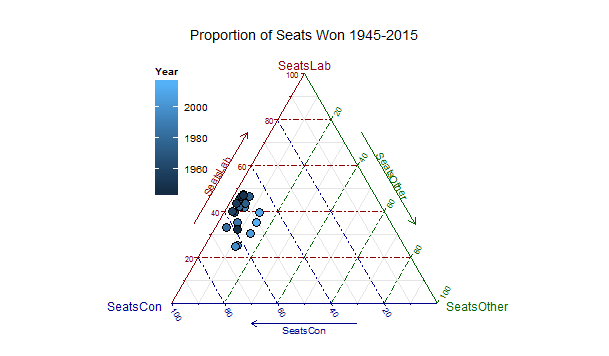
The resulting ternary diagram is:

ukfinalplot

Each point on the graph represent the relative division of seats for each of the 19 elections in the table. The shading represents the year with the darkest being 1945 and the lightest 2015. The diagram clearly shows the trend toward more minor party representation and a move away from the two major parties over time. Indeed coalition governments resulted in several of the more recent elections due to the increase in minor party influence.

My purpose here is not to discuss UK politics but to show how ternary diagrams can be used in a social science application. With the many additions and extensions that are being added to the ggtern package it can be a very power device for graphical analysis.
Ternary Diagrams Using R: The ggtern Package


Ternary Diagrams Using R: The ggtern Package

A tutorial by Douglas M. Wiig

There are a number of very useful and popular graphics packages available for R such as lattice, ggplot, ggplot2 and others. Some of these offer general purpose graphics capabilities and others are more specialized. A recently developed extension to the ggplot2 package is ggtern. This package is essentially a wrapper for a number of functions that can be used to create a variety of ternary diagrams. Ternary diagrams are useful when analyzing the relationship among three factors or elements. A ternary diagram essentially represents the proportions of three related factors in two-dimensional space.

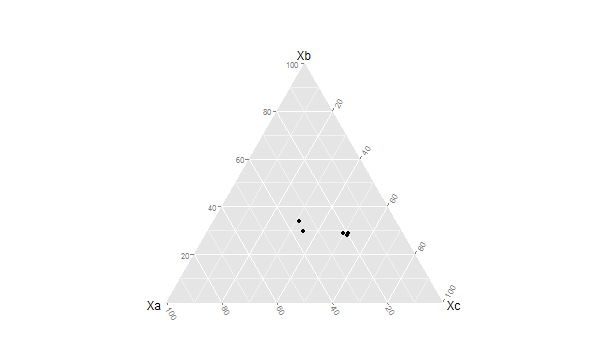
Before running the script in this tutorial make sure that the packages ggplot, ggplot2, and ggtern are loaded into your R environment. A basic graph can be easily constructed. I will the use theoretical quantities Xa , Xb , and Xc to demonstrate a basic ternary diagram. In this simple example I will create a sample of n=5 by entering the data from the keyboard into a data frame ‘sampfile.’ To invoke the editor use the following code:

################################################### #create a sample file of n=5 ################################################### sampfile <-data.frame(Xa=numeric(0),Xb=numeric(0),Xc=numeric(0)) sampfile <-edit(sampfile) ###################################################

This will open up a data entry sheet with three columns labeled Xa, Xb, and Xc. The number that are entered do not matter for purposes of this illustration. The table I entered is as follows:
Xa      Xb        Xc

1 100  135     250

2 90    122     210

3 98    144    256

4 100    97      89

5  90     75      89

To produce a very basic ternary diagram with the above data set use the command:

################################################## #do basic graph with sample data ################################################## ggtern(data=sampfile,aes(x=Xa,y=Xb, z=Xc))+geom_point() ##################################################

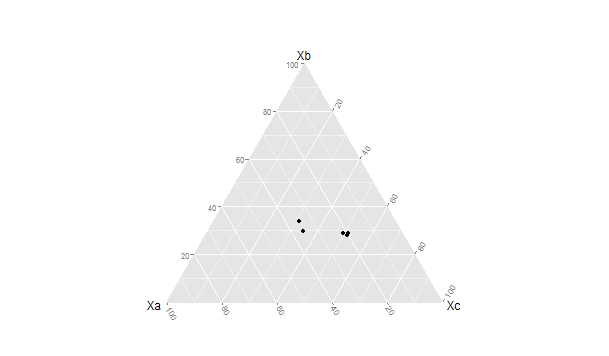
This produces the graph seen below:

ggterm[;ptbasoc
As can be seen the triangular representation of the dimensions Xa →Xb, Xc → Xa and Xb →Xc allow each case to be represented as a single point located relative to each of the three vectors. There are a large number of additions, modifications and tweaks that can be done to this basic pattern.

In the next tutorial I will discuss generating a more elaborate ternary diagram using election outcome data from British general elections. For more information about the ggtern package see the CRAN documentation and information as well as the web site http://www.ggtern.com for all of the latest news and developments.

Using R: Random Sample Selection and One-Way ANOVA


A tutorial by Douglas M. Wiig

In the previous tutorial we looked at the hypothesis that one’s outlook on life is influenced by the amount of education attained. Using the GSS 2014 data file we looked at the education variable ‘educ’, and the outlook on life variable ‘life’, a measure of outlook on life as ‘DULL’, ‘ROUTINE’, or ‘EXCITING.’ We selected a subset for each response category and found that there appeared to be
differences among the mean level of education measured in years for each of the categories of outlook on life. To further examine this we will first randomly select a sample from the data file, look at the
mean education for each category of outlook on life, and evaluate the means using simple one-way ANOVA.

To randomly select a sample from a population of values we can use the sample() function. There are a number of options and variations of the function that are beyond the scope of this tutorial. Since the
variable ‘educ’ is measured in years we can use the sample.int() function which is designed for use with integer values. The general format of the function is:

sample.int(n, size = n, replace = FALSE)

where: n = the size of population the sample is from
size = the size of the sample
replace = FALSE if sampling without replacement; TRUE if sampling with replacement

For this example I will select a sample of n=500 without replacement from the data file containing a total of 2538 cases. The sample data is loaded into a data matrix as it is selected. This will be
accomplished in two steps. In the first step we will load the sample.int() function with the values to use for selecting the sample and put the vector in ‘randsamp2. The code is:

randsamp2 <- sample.int(2538, size=500, replace=FALSE)

To select the sample make sure that make sure that the GSS2014 data file is loaded into the R environment. I previously loaded the data file into a data frame ‘gss14.’  To select the sample and load
it into a data frame ‘randgss2’ the code is:

randgss2 <- gss14[randsamp2,]

Once the sample has been generated we can look at the mean years of education for each of the three responses for outlook on life. We do this by selecting a subset for each response. Use the following
code:

###################################################
#look at educ means by life by selecting 3 subsets from randgss2
###################################################
life12 <- subset(randgss2, life == “DULL”, select=educ)
life22 <- subset(randgss2, life == “ROUTINE”, select=educ)
life32 <- subset(randgss2, life == “EXCITING”, select=educ)

Now run summary statistics for each subset to look at the means:

summary(life12)
summary(life22)
summary(life32)

We can now see that the means are as follows:

life12 = 13.0
life22 = 13.29
life 32 = 14.51

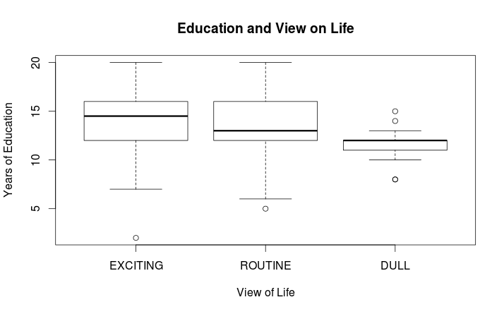
and we can generate a summary visual of the differences among the three subsets by doing a simple boxplot using:

###################################################
# do boxplots of the subsets to visualize differences
#boxplot using educ and life variables from the ‘randgss2’ data #frame
###################################################
boxplot(randgss2$educ ~ randgss2$life, main=”Education and View on Life n = 500″, xlab=”View of Life”,ylab=”Years of Education”)

The following graph will result:

Rplotrandgss2

As can be seen above there does appear to be a difference among these means, particularly for those who see life as ‘DULL.’ To see if these differences are significant an ANOVA will be run using the
simple one way ANOVA function aov(). The basic function is:
aov(formula, data = NULL)For our example we use:

model2 <- aov(educ ~ life, data=randgss2)

which analyzes the mean education by category of outlook on life using the randgss2 sample of n=500. The results are stored in ‘model2.’ The output from this operation is shown using the summary() function. This produces the following output:

summary(model2)

Df Sum Sq Mean Sq F value Pr(>F) life
2  171.5    85.77     10.42 4.08e-05 ***
Residuals  332     2732.2  8.23

Signif. codes: 0 ‘***’ 0.001 ‘**’ 0.01 ‘*’ 0.05 ‘.’ 0.1 ‘ ’ 1
165 observations deleted due to missingness

This output shows that at least one of the means differs significantly from the others. To test this difference further we can use a pair-wise comparison of means to see which means differ significantly
from each other. There are several options available. We will use a basic Tukey HSD comparison. This is accomplished using:

##################################################
#run HSD on sample
TukeyHSD(model2)
##################################################

producing the following output:

Tukey multiple comparisons of means
95% family-wise confidence level

Fit: aov(formula = educ ~ life, data = randgss2, projections = TRUE)

$life                               diff                     lwr                upr                    p adj
ROUTINE-EXCITING -1.074404 -1.833686 -0.31512199  .0027590
DULL-EXCITING          -2.729412 -4.447386 -1.01143754  .0006325
DULL-ROUTINE           -1.655008 -3.384551 0.07453525 00640910

By looking at the p value for each comparison it can be seen that both the ROUTINE-EXCITING and DULL-EXCITING means differ significantly at p ≤ .05

I might point out that if a researcher was using the GSS 2014 data file as we used here there would need to be more data preparation prior to running any analysis. For example, there is a fair amount of
missing data as indicated by NA in the raw data file. The missing data would need to be handled in some way. R has numerous functions and packages that can assist in resolving missing data issues of
various types, but a discussion of these is a subject for a future tutorial.
8/7/15                   Douglas M. Wiig                    http://dmwiig.net

Tutorial: Using R to Analyze NORC GSS Social Science Data, Part Six, R and ANOVA


Tutorial: Using R to Analyze NORC GSS Social Science Data, Part Six, R and ANOVA

A tutorial by Douglas M. Wiig

As discussed in previous segments of this tutorial, for anyone interested in researching social science questions there is a wealth of survey data available through the National Opinion Research Center (NORC) and its associated research universities. The Center has been conducting a national survey each year since 1972 and has compiled a massive database of data from these surveys. Most if not all of these data files can be accessed and downloaded without charge. I have been working with the 2014 edition of the data and for all part of this tutorial will use the GSS2014 data file that is available for download on the Center’s web site. (See the NORC main website at http://www.norc.org/Research/Projects/Pages/general-social-survey.aspx and at http://www3.norc.org/GSS+Website ).

Accessing and loading the NORC GSS2014 data set was discussed in part one of this tutorial. Refer to it if you need specific information on downloading the data set in STATA or SPSS format.  In this segment we will use the subset function to select a desired set of cases from all of the cases in the data file that meet certain criteria.  As indicated in my previous tutorial the GSS2014 data set contains a
total of 2588 cases and 866 variables.

Before starting this segment of the tutorial be sure that the foreign
package is installed and loaded into your R session. As I have indicated in previous tutorials, use of an IDE such as R Studio greatly facilitates entering and debugging R code when doing research such as is discussed in my tutorials.  

Import the GSS 2014 data file in SPSS format and load it into the data frame ‘gss14’ using:
#########################################################import  GSS2014 file in SPSS .sav format
#uses foreign package
########################################################require(foreign)
gss14<- read.spss("/path to your location/GSS2014.sav",                      use.value.labels=TRUE,max.value.labels=Inf, to.data.frame=TRUE)
#################################################

In this tutorial the analysis of this sample will focus on examining the hypothesis “An individual’s outlook on life is influenced by the amount of education the person has attained.” The GSS variables ‘educ’, education in number of years and ‘life’, whether the respondent rated life DULL, ROUTINE, or EXCITING. A simple approach to testing this hypothesis is to compare mean levels of education for each of the three categories of response. I will do this analysis in two stages. In the first stage I will use techniques discussed in a previous tutorial to select a subset of each response category and display the mean education level for each of the three categories.

The three subsets life1, life2, and life3 are generated using the following code:

###################################################
# create 3 subsets from gss14 view on life by years of education
##################################################

life1 <- subset(gss14, life == “DULL”, select=educ)

life2 <- subset(gss14, life ==”ROUTINE”, select=educ)

life3 <- subset(gss14, life == “EXCITING”, select=educ)

###################################################

#The three means of the subsets are displayed using the code:

# run summary statistics for each subgroup

##################################################

summary(life1)

summary(life2)

summary(life3)

###################################################

resulting the following output:
educ
Min. : 0.00
1st Qu.:10.00
Median :12.00
Mean :11.78
3rd Qu.:13.00
Max. :20.00

summary(life2)
educ
Min. : 0.00
1st Qu.:12.00
Median :13.00
Mean :13.22
3rd Qu.:16.00
Max. :20.00
NA’s :1

summary(life3)
educ
Min. : 2.00
1st Qu.:12.00
Median :14.00
Mean :14.31
3rd Qu.:16.00
Max. :20.00

As is seen above there does appear to be a difference among mean years of education and the corresponding outlook on life. In order to examine whether or not these observed differences are not due to chance a simple one-way Analysis of Variance can be generated.

In the next tutorial I will discuss performing the ANOVA and using pair-wise comparisons to determine which if any means are different.

R Tutorial: Using the NORC GSS2014 Data File, Creating and Using Subsets


R Tutorial:  Using the NORC GSS2014 data file, creating and using subsets

By Douglas M. Wiig

As discussed in the first part of this tutorial, for anyone interested in researching social science questions there is a wealth of survey data available through the National Opinion Research Center (NORC) and its associated research universities. The Center has been conducting a national survey each year since 1972 and has compiled a massive database of data from these surveys. Most if not all of these data files can be accessed and downloaded without charge. I have been working with the 2014 edition of the data and for all part of this tutorial will use the GSS2014 data file that is available for download on the Center’s web site. (See the NORC main website at http://www.norc.org/Research/Projects/Pages/general-social-survey.aspx and at http://www3.norc.org/GSS+Website ).

Accessing and loading the NORC GSS2014 data set was discussed in part one of this tutorial. Refer to it if you need specific information on downloading the data set in STATA or SPSS format.  In this segment we will  use the subset function to select a desired set of cases from all of the cases in the data file that meet certain criteria.  As indicated in my previous tutorial the GSS2014 data set contains a total of 2588 cases and 866 variables.

One of the areas surveyed by NORC each year deals with attitudes toward abortion. One of the questions simply asks respondents if they '...approve of abortion under any circumstances.'  The response is either YES or NO to this question.  Let's assume a researcher is interested in investigating whether or not education has an effect on how the respondent answers the question.

To look at this hypothesis we can use the abortion attitude variable mentioned above, 'abany', and an education variable 'educ' which measures education as the actual number of years of education.  Twelve years of education would be a high school graduate for example, and 16 years would be a college graduate.  We can select a subset of all respondents who indicated 'YES' on the survey question and then generate a mean years of education for this subset.  We can then select a subset of all respondents who indicated 'NO' on the question and calculate a mean years of education for the second subset.

Before starting this code segment be sure that the foreign package is installed and loaded into your R session.  Import the GSS 2014 data file and load it into the data frame ‘Dataset’ using:

########################################################
#import GSS2014 file in SPSS .sav format
#uses foreign package
########################################################
require(foreign)
Dataset <- read.spss("/path to your location/GSS2014.sav", 
                     use.value.labels=TRUE, max.value.labels=Inf, to.data.frame=TRUE)
########################################################

Once the GSS2014 file is loaded use the subset function to select your first subset of respondents who answered the 'abany' question with and 'YES response.  Use the following code to select the subset and store it in a data frame 'SS1':

####################################################
#select subset from Dataset and write to data frame SS1
####################################################
SS1 <- subset(Dataset, abany == "YES", select=educ)
View(SS1)
####################################################

Now select a second subset of respondents who answered the 'abany' question with a 'NO' response. Use the following code to select the subset and store in a data frame 'SS2':

######################################################
#select subset from Dataset and write to data frame SS2
######################################################
SS2 <- subset(Dataset, abany == "NO", select=educ)
View(SS2)
######################################################

In using the subset function as seen above the name of the data set is specified, the criteria for selecting rows is given, and the variables to select from each row specified.  If no 'select' option is given all variables will be shown for the selected row.

Using the View command to examine each subset shows the years of education for each of the 746 respondents who answered ‘YES’ and each of the 907 respondents who answered ‘NO.’ Since the variable ‘educ’ is measured as ratio level numeric data we can calculate a mean and standard deviation for each subset and perform both graphical and statistical analysis of any observed difference between the two means. This will be the subject of the next installment of the tutorial.

Using R in Nonparametric Statistical Analysis, The Kruskal-Wallis Test Part Three: Post Hoc Pairwise Multiple Comparison Analysis of Ranked Means


Using the Kruskal-Wallis Test, Part Three:  Post Hoc Pairwise Multiple Comparison Analysis of Ranked Means

A tutorial by Douglas M. Wiig

In previous tutorials I discussed an example of entering data into a data frame and performing a nonparametric Kruskal-Wallis test to determine if there were differences in the authoritarian scores of three different groups of educators. The test statistic indicated that at least one of the groups(group 1) was significantly different from the other two.

In order to explore the difference further it common practice to do post hoc analysis of the differences. There are a number of methods that have been devised to do these comparisons, but one of the most straightforward and easiest to understand is pairwise comparison of ranked means(or means if using standard ANOVA.)

Prior to entering the code for this section be sure that the following packages are installed and loaded:

       PMCMR

   prirmess

In part one data was entered into the R editor to create a data frame. Data frames can also be created directly using R script. The script to create the data frame for this example uses the following code:

#create data frame from script input

>Group <- c(1,1,1,1,1,2,2,2,2,2,3,3,3,3)

>authscore <-c(96,128,83,61,101,82,121,132,135,109,115,149,166,147)

>kruskal <- data.frame(Group, authscore)

The group identifiers are entered and assigned to the variable Group, and the authority scores are assigned to the variable authscore. Notice that each identifier is matched with an appropriate authscore just as they were when entered in columns using the data editor. The vectors are then assigned to the variable kruskal to create a data.frame. Once again the structure of the data frame can be checked using the command:

>str(kruskal)

resulting in:

'data.frame':   14 obs. of  2 variables:
 $ Group    : num  1 1 1 1 1 2 2 2 2 2 ...
 $ authscore: num  96 128 83 61 101 82 121 132 135 109 ...

>

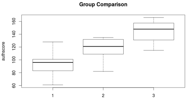
It is often useful to do a visual examination of the ranked means prior to post hoc analysis. This can be easily accomplished using a boxplot to display the 3 groups that are presented in the example. If the data frame created in tutorial one is still in the global environment the boxplot can be generated with the following script:

>#boxplot using authscore and group variables from the data frame created in part one

>boxplot(authscore ~ group, data=kruskal, main=”Group Comparison”, ylab=”authscore”)

>

The resulting boxplot is seen below:

Rplot5

As can be seen in the plot, authority score differences are the greatest between group 1 and 3 with group 2 In between. Use the following code to run the Kruskal-Wallis test and examine if any of the means are significantly different:

#library(PMCMR)

with(kruskal, {

posthoc.kruskal.nemenyi.test(authscore, Group, “Tukey”)

}

The post hoc test used in this example is from the recently released PMCMR R package. For details of this and other post hoc tests contained in the package( see Thorsten Polert, Calculate Pairwise Multiple Comparisons of Mean Rank Sums, 2015. http://cran.r-project.org/web/packages/PMCMR/PMCMR.pdf.) The test employed here used the Tukey method to make pairwise comparisons of the mean rank authoritarianism scores of the three groups. The output from the script above is:

Pairwise comparisons using Tukey and Kramer (Nemenyi) test

with Tukey-Dist approximation for independent samples

data: authscore and Group

      1                    2

2   0.493             –

3    0.031        0.310

P value adjustment method: none

The output above confirms what would be expected from observing the boxplot. The only means that differ significantly are means 1 and 3 with a p = .031.

The PMCMR package will only work with R versions 3.0.x. If using an earlier version of R another package can be used to accomplish the post hoc comparisons. This package is the pgirmess package (see http://cran.r-project.org/web/packages/pgirmess/pgirmess.pdf for complete details). Using the vectors authscore and Group that were created earlier the script for multiple comparison using the pgirmess package is:

library(pgirmess)

authscore <- c(96,128,83,61,101,82,121,132,135,109,115,149,166,147)

Group <- c(1,1,1,1,1,2,2,2,2,2,3,3,3,3)

kruskalmc(authscore ~ Group, probs=.05, cont=NULL)

and the output from this script using a significance level of p = .05 is:

Multiple comparison test after Kruskal-Wallis

p.value: 0.05

Comparisons

      obs.dif    critical.dif     difference

1-2    3.0        6.333875         FALSE

1-3    7.1        6.718089         TRUE

2-3    4.1        6.718089        FALSE

>

As noted earlier the comparison between groups one and three is shown to be the only significant difference at the p=.05 level.

Both the PMCMR and the pgirmess packages are useful in producing post hoc comparisons with the Kruskal-Wallis test. It hoped that the series of tutorials discussing nonparametric alternatives common parametric statistical tests has helped demonstrate the utility of these approaches in statistical analysis.

In part four I will post the complete script used in all three tutorials.

Book Review: R High Performance Programming


A book review by Douglas M. Wiig

Aloysius Lim and William Tjhi. R High Performance Programming. Birmingham, UK: Packt Publishing Ltd., 2015. bit.ly/14Rhpp

R High Performance Programming is a well written, informative book most suited for the experienced R programmer. This book offers a handy guide for R users who need speed and efficiency for the tasks that they perform.

The authors begin with an informative chapter discussing some of the inherent constraints on R’s computing performance such as CPU and RAM usage, and how R code is interpreted on the fly rather than compiled. A guide to several methods of profiling R’s code execution time, memory allocation and CPU usage is discussed in the next chapter. Sample code included in the chapter allows the reader to experiment with various benchmarking techniques to measure processing time and memory usage. This chapter provides the reader with some good tools for benchmarking R projects and identifying areas where improvements in processing can be made.

As is always the case with technical books from Packt Publishing, ample code examples are used in the chapter and the complete code used in each chapter is available for download with the book. This is a very handy feature and allows readers to do some live programming with R as the book is read.

The authors discuss a number of simple tweaks that can be easily performed to increase processing speed such as using built in functions and using hash tables. The hash table technique is useful for applications that use frequent lookups and can dramatically reduce processing time when compared to the use of lists. Running example code using this technique shows a large decrease in processing time when using the hash table approach as compared to straight list processing lookups.

In chapter 4 the authors discuss the use of compiled R code and integrating compiled languages into R code. They show several examples of using the R package inline that allows users to embed C, C++, Objective-C, Objective-C++ and Fortran code within R. Once again there are ample code examples to illustrate the use of this technique. For more advanced uses of compiled code the authors discuss how to create entire modules coded in C++ using the Rcpp package. Several completed code examples are included to illustrate the technique.

Another interesting approach to speeding up R is discussed in a chapter that explores several R packages designed to exploit the capability of GPU’s (Graphic Processing Cards) that are a used in many computers. These techniques can facilitate creating very fast and efficient statistical modeling code using R and the GPU.

As indicated above, readers can download the code package included with the book and find a well-organized set of ten folders (one for each chapter) containing 51 files. These files contain the sample code from the book as well as other code segments and benchmark code discussed in the book. The authors indicate that the code has been tested on R 3.1.1, Ubuntu 14.04 Trusty Tahr, Mac OS X 10.9 Mavericks, and Windows 8.1. This allows integration of these code segments into the reader’s own projects with minimal changes.

Other chapters in R High Performance Programming discuss simple tweaks to use less memory, techniques to speed processing of large datasets and using parallel processing and clustering techniques. The last chapter contains a discussion of using R and Hadoop to process Big Data (massive datasets with sizes measured in petabytes -one petabyes is 1,048,576 gigabytes). Processing data of this magnitude presents many challenges and is an area that is currently the subject of much program development.

I found R High Performance Programming to be a useful and informative book for the advanced user of R. A working knowledge of statistics, R and other programming languages such as C++ or Java is necessary to realize the full benefit of the techniques presented in the book. The book also serves as a good learning tool for less knowledgeable R users who are seeking to advance their programming skills.

Readers who are interested in the use of Hadoop and cluster computer processing might find the book Raspberry Pi Super Cluster by Andrew K. Dennis of interest. (Packt Publishing, 2013

PAC-14-1987838-1387169). A review of this book can be found on my web site at http://dmwiig.net.

Reviewer Information:

Douglas M. Wiig, Professor of Political Science

Grand View University

Teaching areas include social science statistics and research methods, comparative politics, international politics.

Long time user and developer of computer and statistical applications

Host of Open Source Technology in Higher Education web site at http://dmwiig.net

Creator and moderator of LinkedIn discussion forum “Open Source Technology in Higher Education”

Regular contributor to several LinkedIn discussion forums

Author of numerous tutorials on using the R statistical programming language and Raspberry Pi computer